Project:
Red Roaster
Key Message:
A year-round oasis.
Red Roaster
Key Message:
A year-round oasis.
Sector:
Hospitality
Scope of Works:
Art Direction
Branded Environments
Brand Identity
Digital Design
Creative Strategy
Graphic Design
Livery Design
Naming
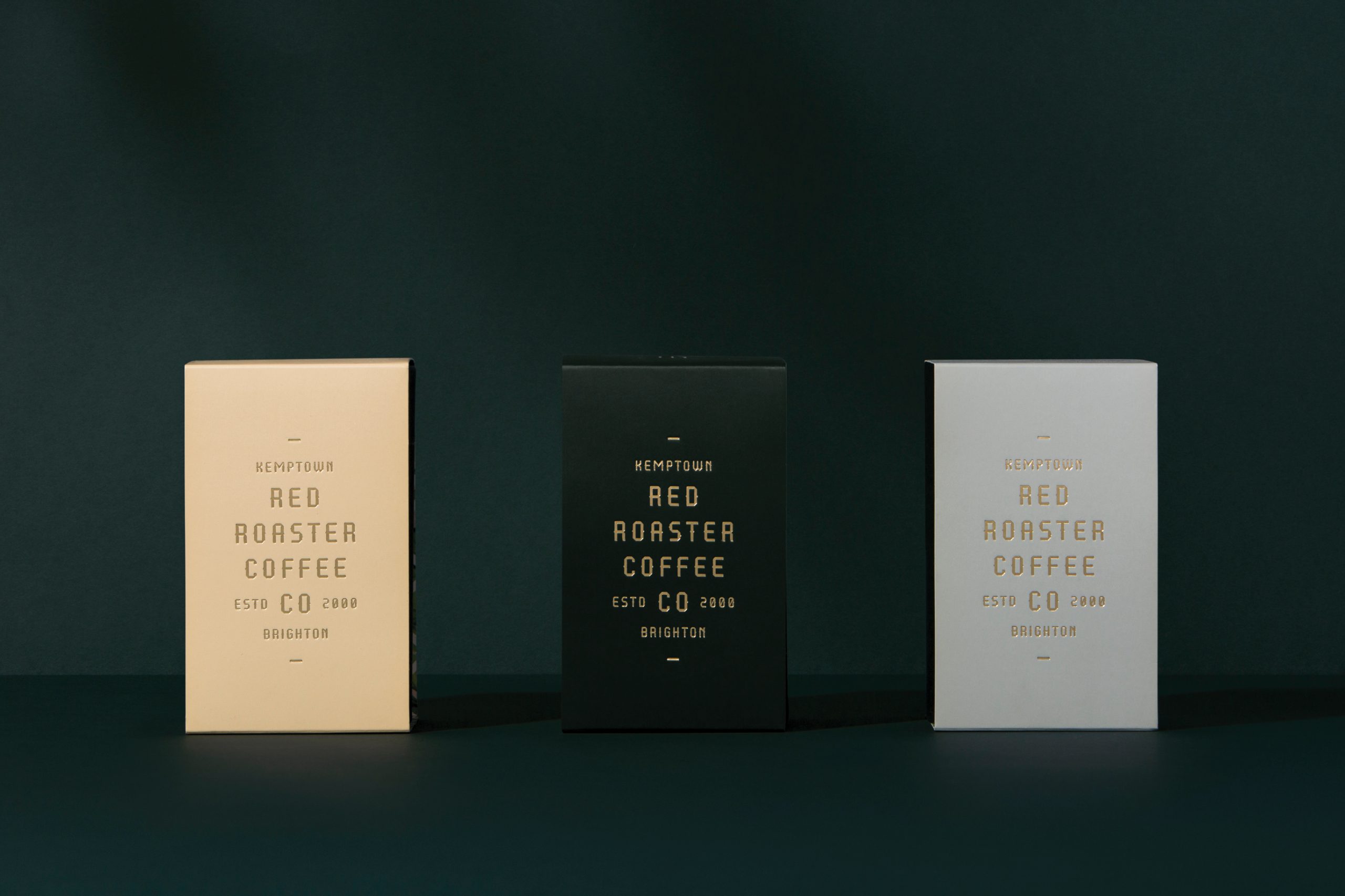
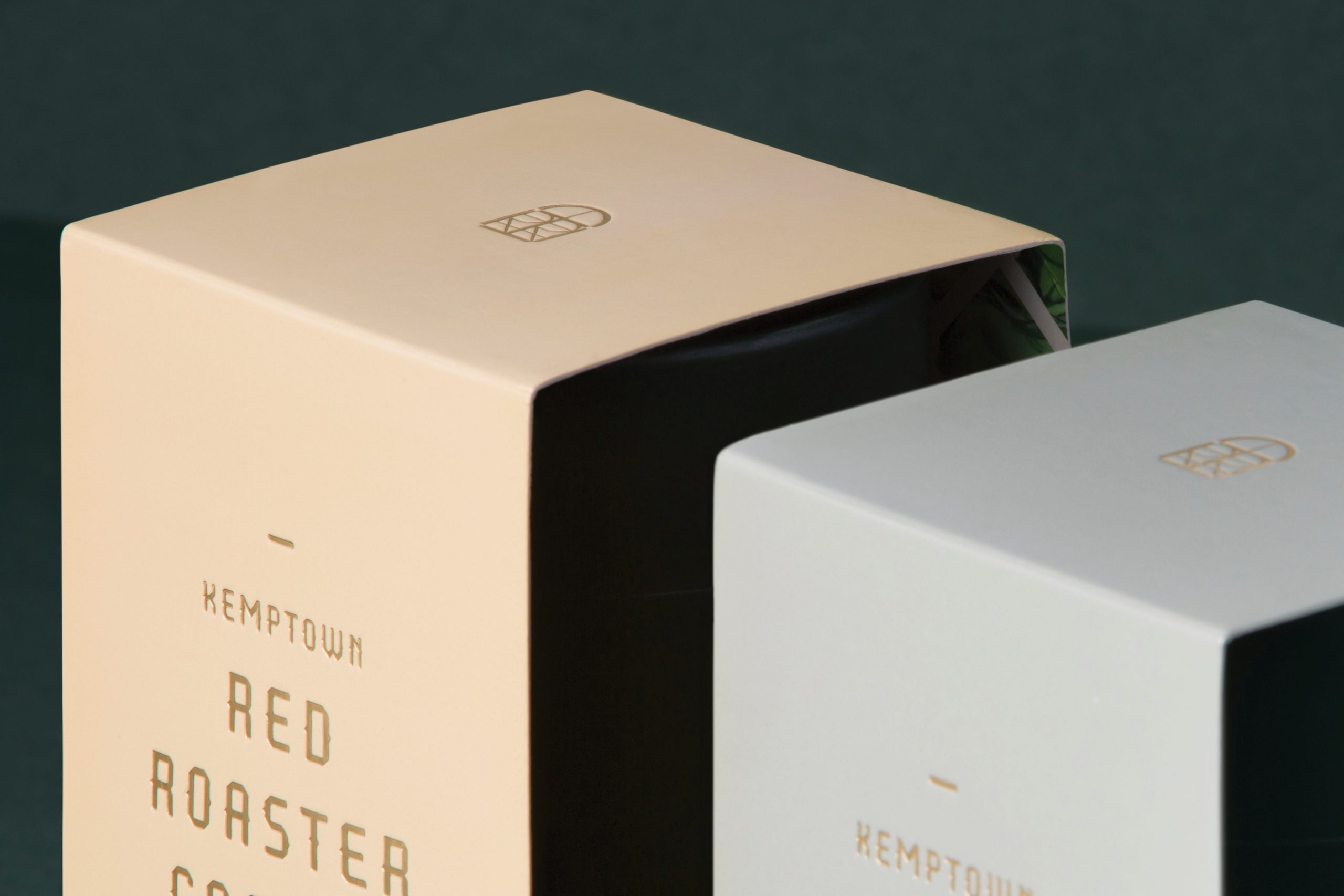
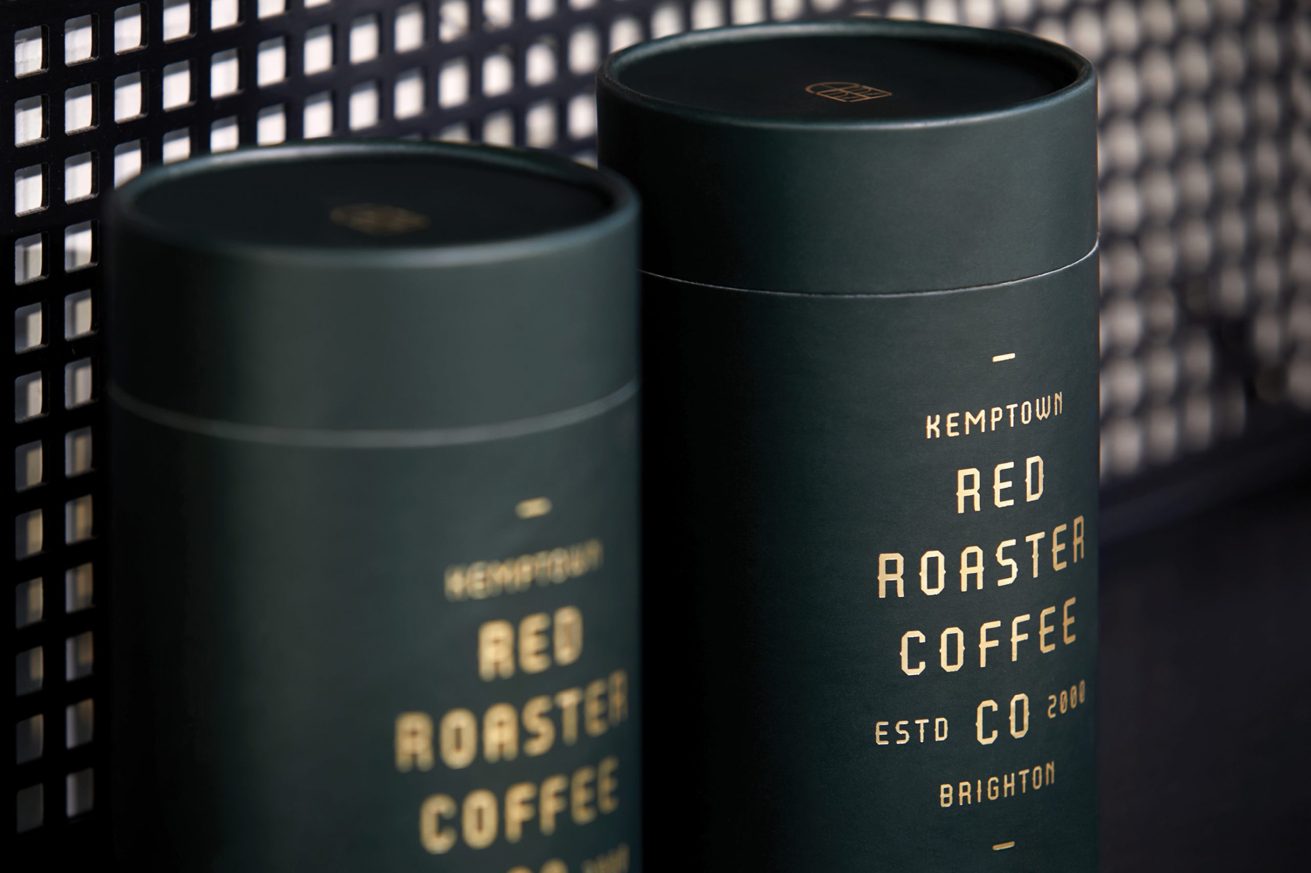
Packaging
Print Design
Hospitality
Scope of Works:
Art Direction
Branded Environments
Brand Identity
Digital Design
Creative Strategy
Graphic Design
Livery Design
Naming
Packaging
Print Design
Snapshot:
Redroaster Coffee Co. is a pioneer of speciality coffee in the UK. It has been loved and shaped by the people of Brighton for the past sixteen years. Redroaster is characterised by the community that helped create the welcoming social space that it is. Everyone knows everyone else; the barriers and formalities between ‘staff member’ and ‘customer’ have become blurred. Redroaster will always put people and experience first and will be thought of as a credit to the community.
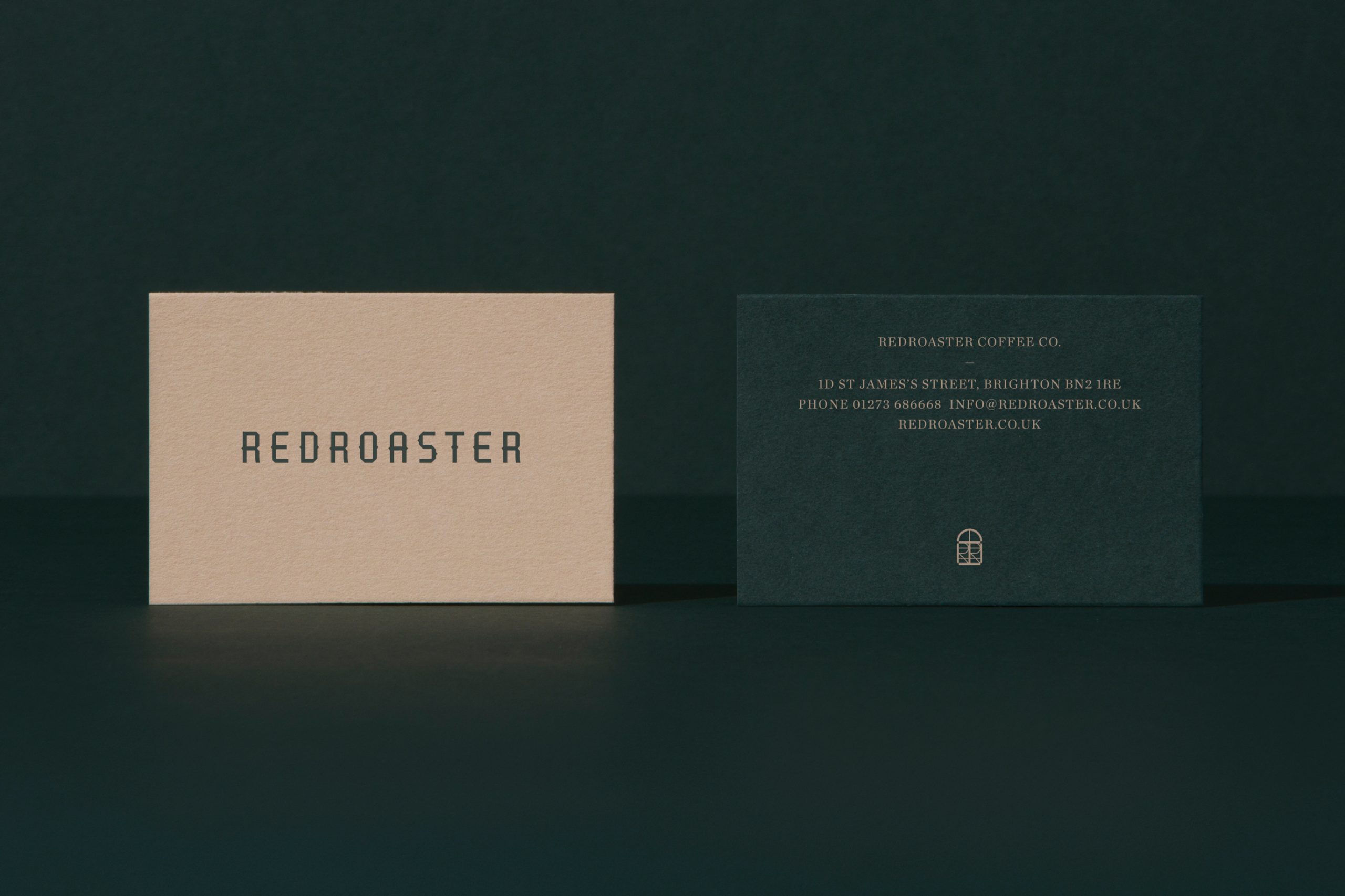
The Objective: A refreshed brand identity, signage and aesthetic approach that would align with the client’s reputation as a pioneer and innovator.
The Opportunity: In Brighton, UK, Redroaster was considered a pioneer in the coffee and cafe experience - but its brand and decor were tired. Our challenge was to create something unique and modern, with a touch of Melbourne, that would provide a refreshed and reinvigorated brand identity without relinquishing the considerable brand equity that existed within the local community.
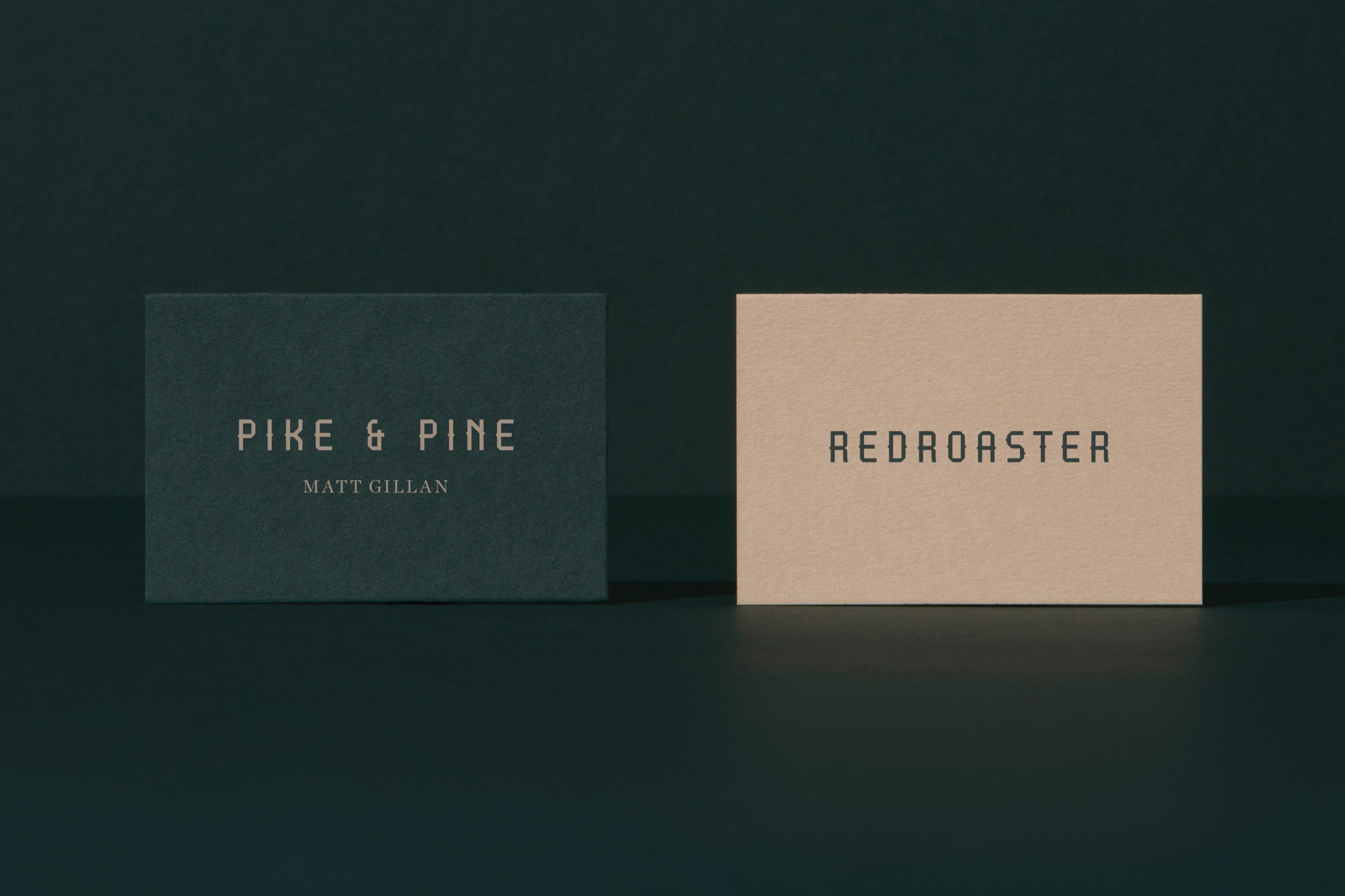
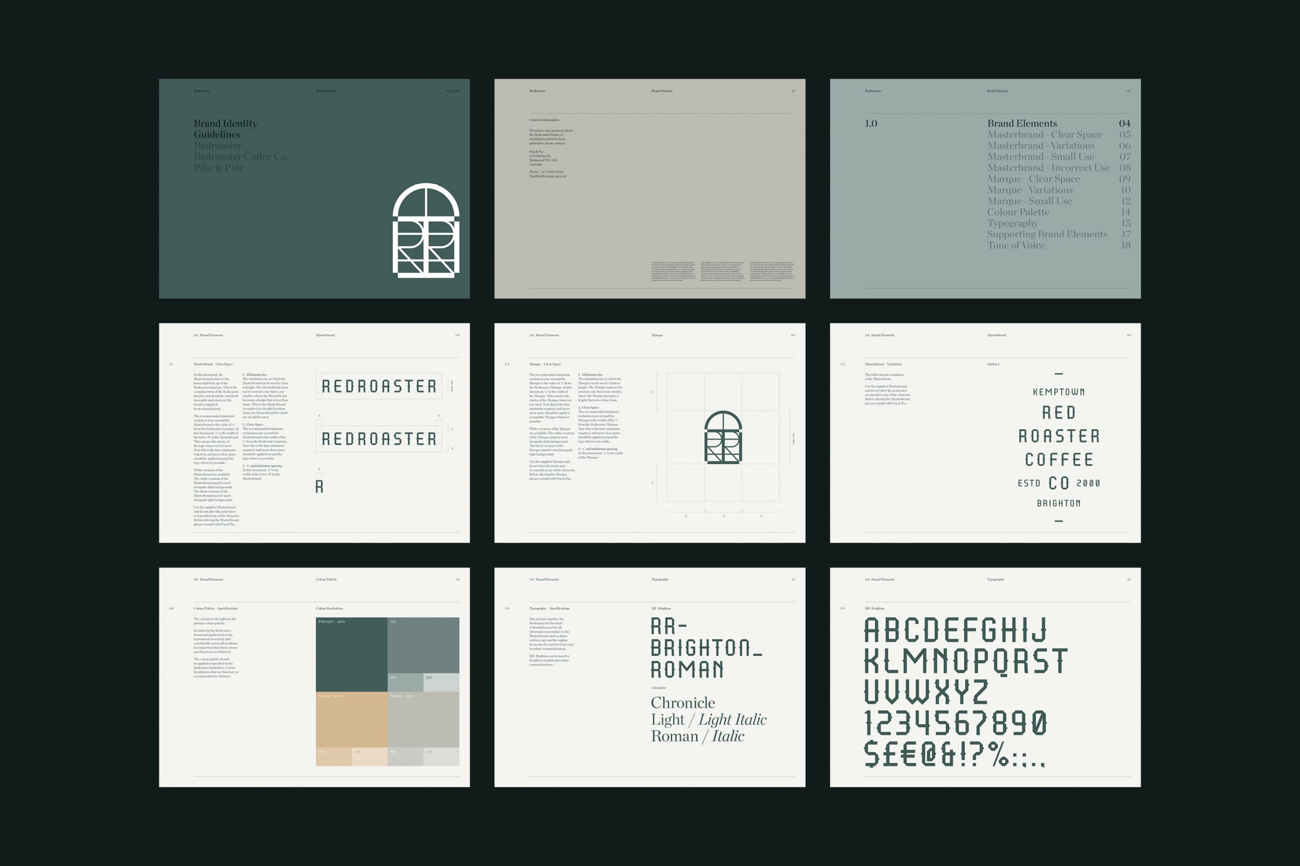
The Outcome: With interior design firm Stella Collective engaged by the client, the concept of ‘Botanical Punk’ was born. Being at the mercy of UK winters, when outdoor dining is not an option, Stella Collective created a year-round oasis, bringing the outside in. Our creative approach reflected this idea, with a typeface that challenged the expected and embodied the slightly oddball - yet beautiful - nature of the town.
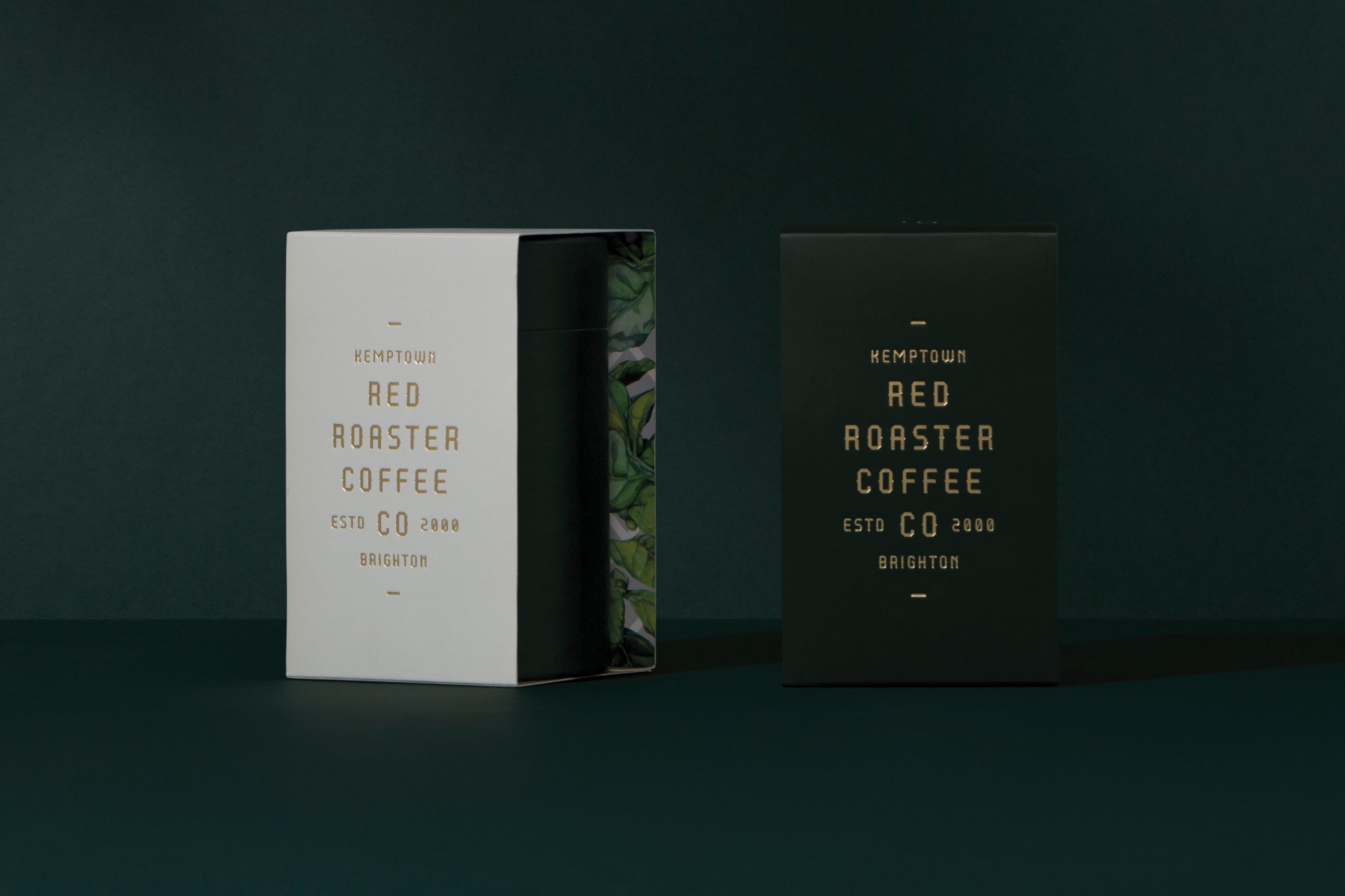
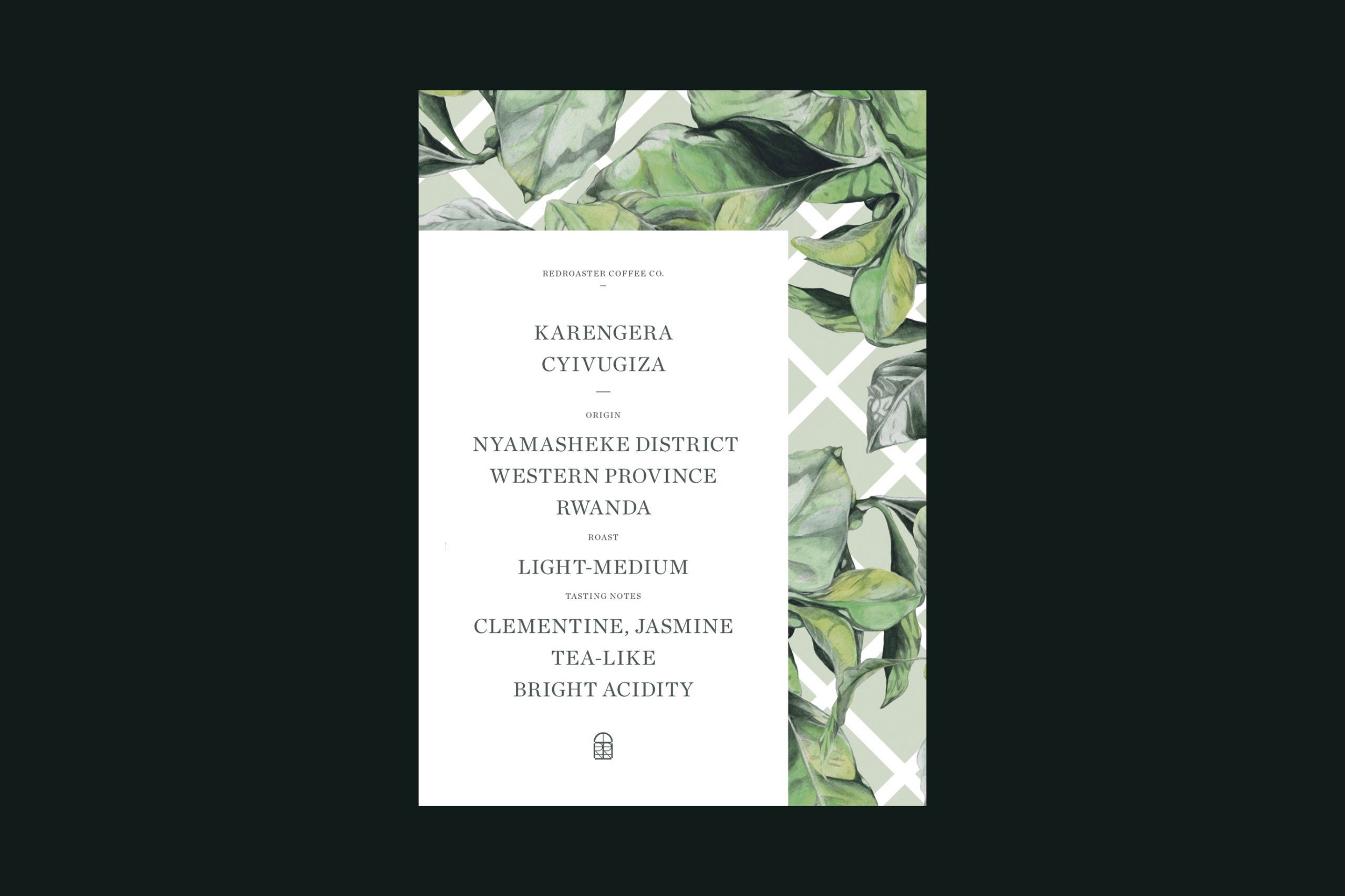
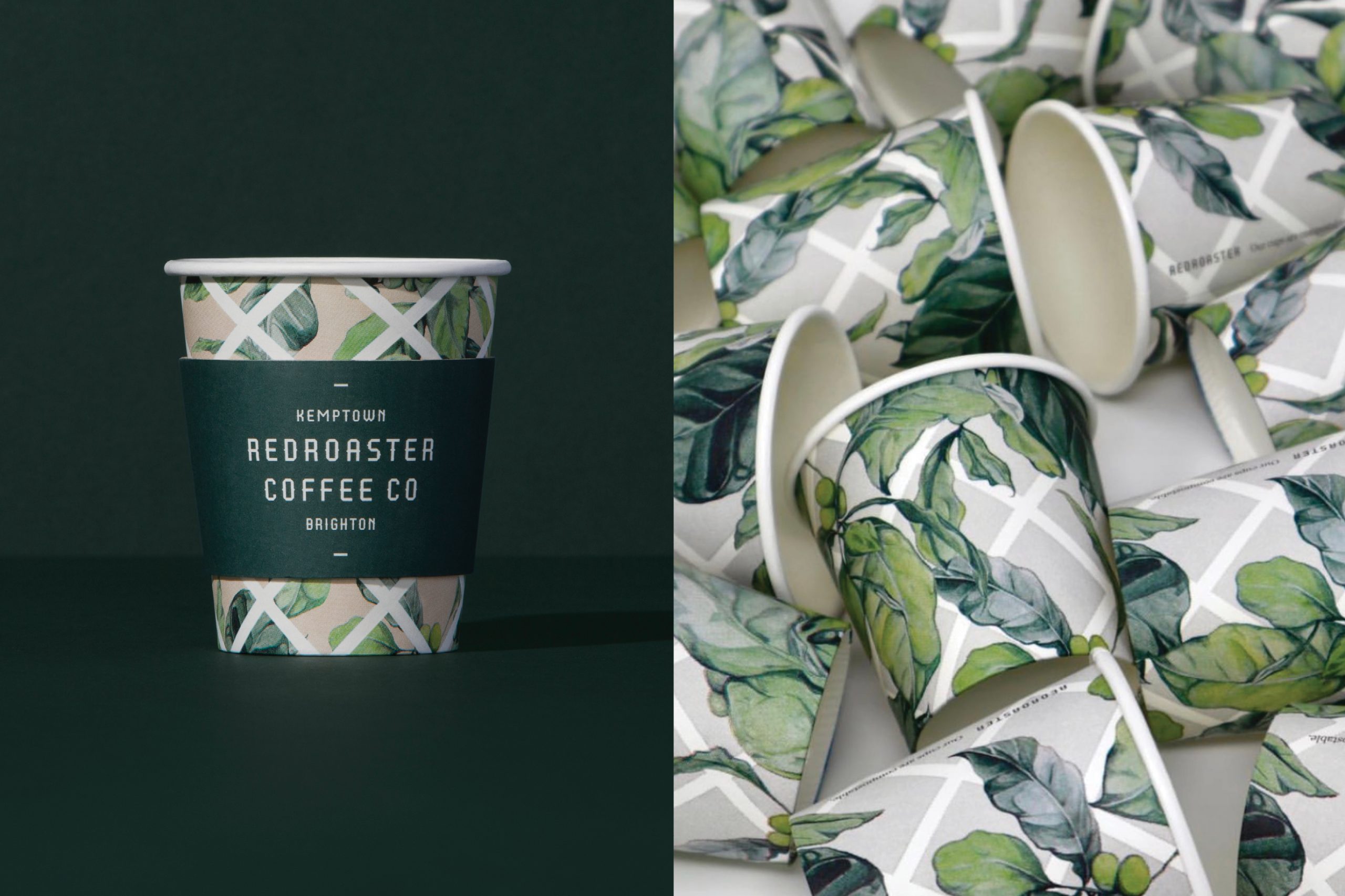
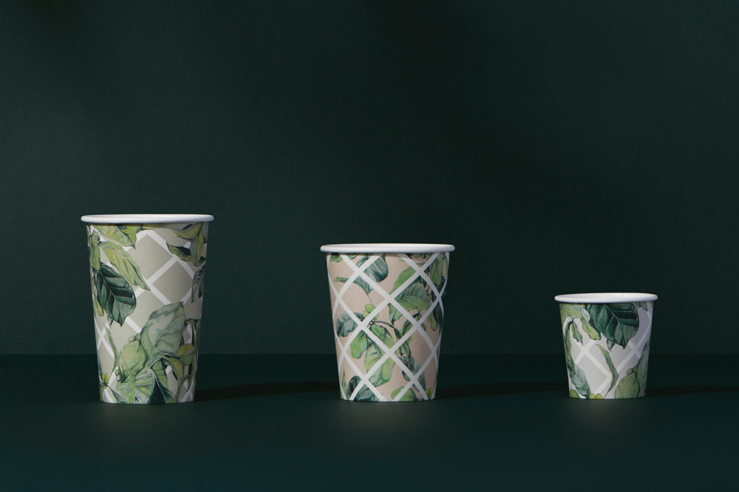
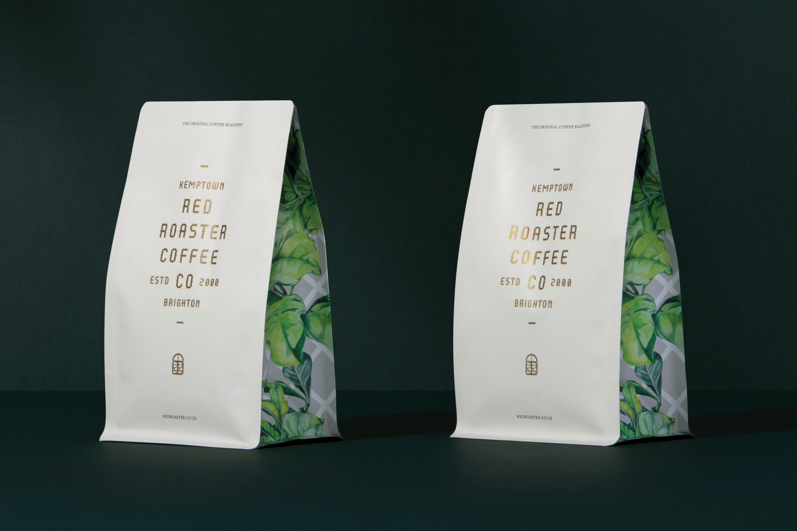
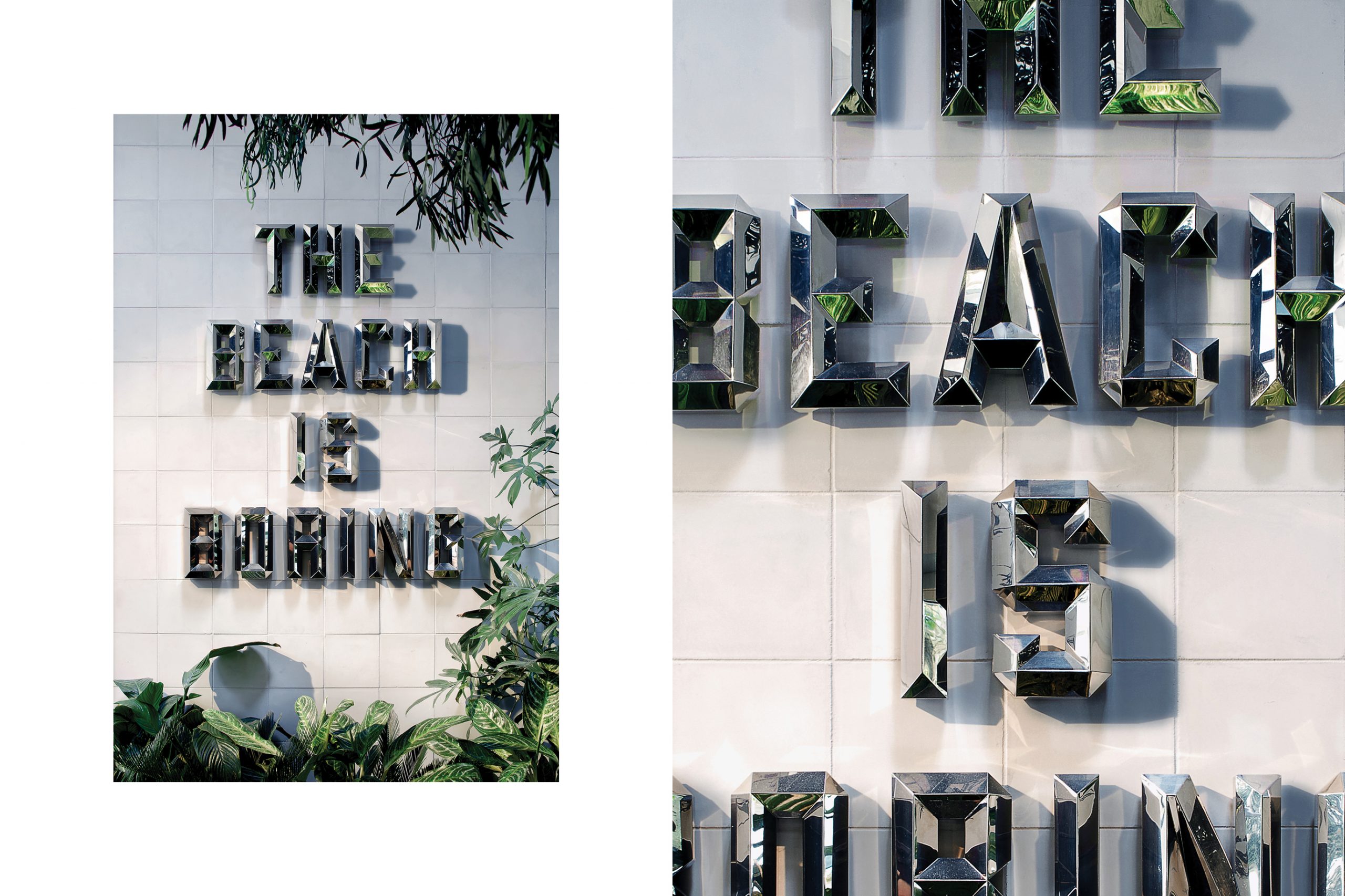
Commissioned illustration by Melbourne artist Amery Johnston captured the literal qualities of the oasis and complemented the brands other visual elements, as well as being featured on the coffee packaging. Cheeky signage executions e.g. “The beach is boring” helped define the playful and welcoming nature of the space.
Credits:
Architecture by Studio C102
Commissioned Illustration by Thought & Found
Interior Design by Stella Collective
Photography (Architectural) by Julian Abrams
Photography (Collateral) by Foliolio
Packaging Production by Packaging People
Architecture by Studio C102
Commissioned Illustration by Thought & Found
Interior Design by Stella Collective
Photography (Architectural) by Julian Abrams
Photography (Collateral) by Foliolio
Packaging Production by Packaging People
