Project:
Mere
Key Message:
Future Beauty Naturally Awoken.
Mere
Key Message:
Future Beauty Naturally Awoken.
Sector:
Beauty
Scope of Works:
Art Direction
Brand Identity
Digital Design
Creative Strategy
Copywriting
Graphic Design
Illustration
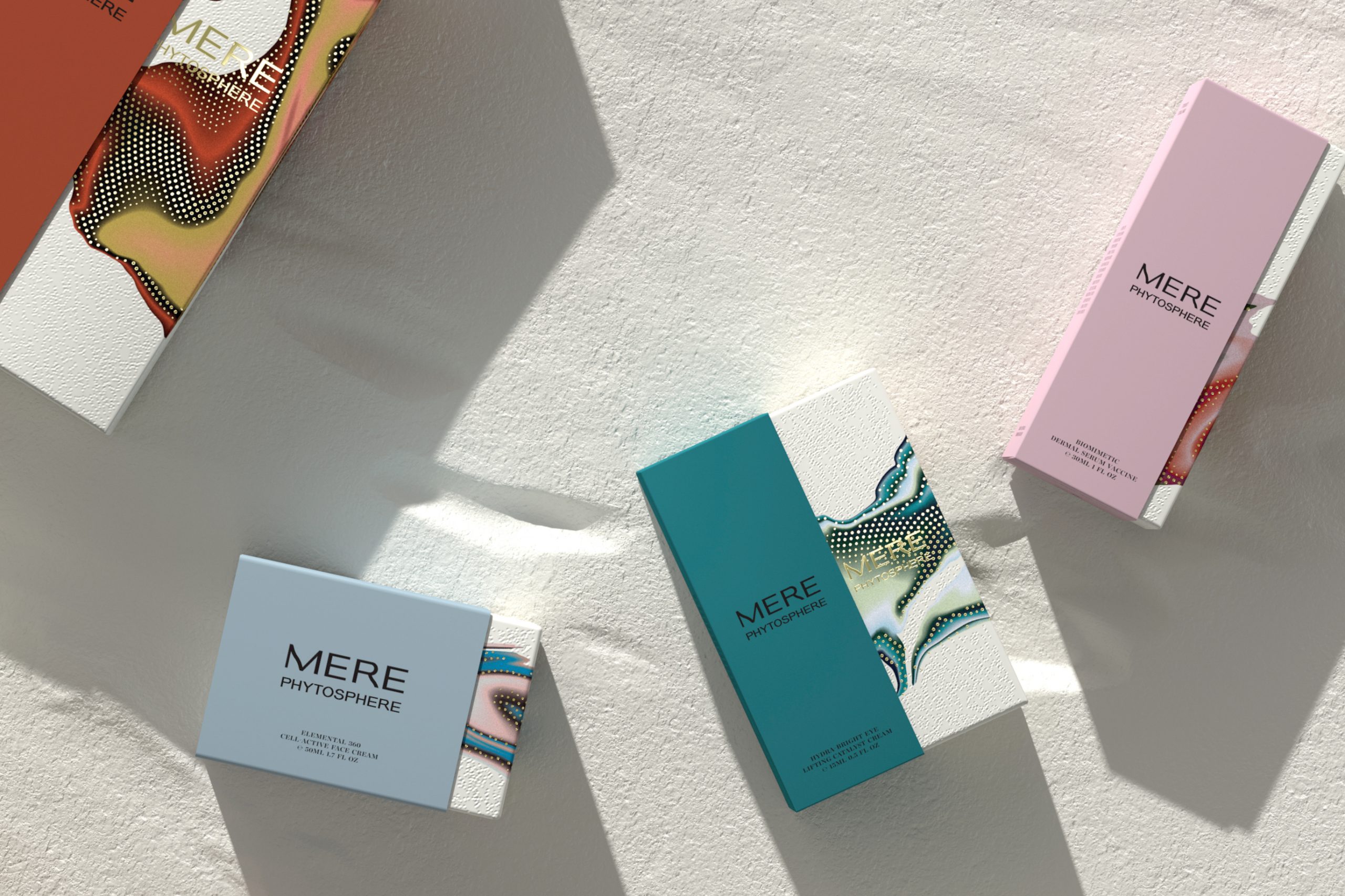
Packaging
Beauty
Scope of Works:
Art Direction
Brand Identity
Digital Design
Creative Strategy
Copywriting
Graphic Design
Illustration
Packaging
Snapshot:
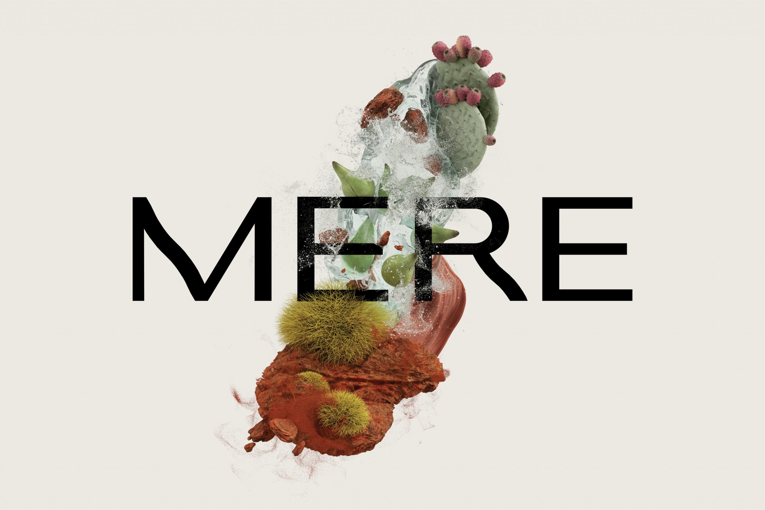
Born of a land of beautiful extremes, MERE is a powerful collision of cutting-edge clinical advancements and super natural botanical and marine extracts, sourced right from Australia’s pristine and biodiverse ecosystem. Pure, potent natural skin care that activates skin at a cellular level, MERE Phytosphere is a future ready fusion of progressive natural bioactives that delivers visible, transformative results.
The Objective: A new brand identity that could communicate the Australian origins of the brand to appeal primarily to an Asian market, where Australian-made beauty brands (‘A-Beauty’) are held in the highest regard due to the quality of ingredients and production standards.
The Opportunity: Create a compelling visual and verbal identity that showcases the power and beauty of Australia’s natural landscape while also highlighting the active scientific hydrating/restorative properties of the products.
The Outcome: The graphics take inspiration from all areas of Australia’s natural biosphere without being overt or predictable. The unmistakably unique and experimental visual approach provides maximum cut-through opportunity within the saturated cosmetics market segment. The custom typography/logotype unites the natural with the scientific, the organic with the structured.
Credits:
Brand Visuals by 3D2D
Digital Marketing by Tailor Group
Copywriting by OneWord Studio
Content Production by Crater
Printing (Bottles) by Bottle Printing
Printing (Outer Packs) by WestRock
Brand Visuals by 3D2D
Digital Marketing by Tailor Group
Copywriting by OneWord Studio
Content Production by Crater
Printing (Bottles) by Bottle Printing
Printing (Outer Packs) by WestRock


