Project:
Inglewood
Key Message:
Coffee is life.
Inglewood
Key Message:
Coffee is life.
Sector:
Food & Beverage
Scope of Works:
Art Direction
Branded Environments
Brand Identity
Digital Design
Creative Strategy
Graphic Design
Packaging
Print Design
Food & Beverage
Scope of Works:
Art Direction
Branded Environments
Brand Identity
Digital Design
Creative Strategy
Graphic Design
Packaging
Print Design
Snapshot:
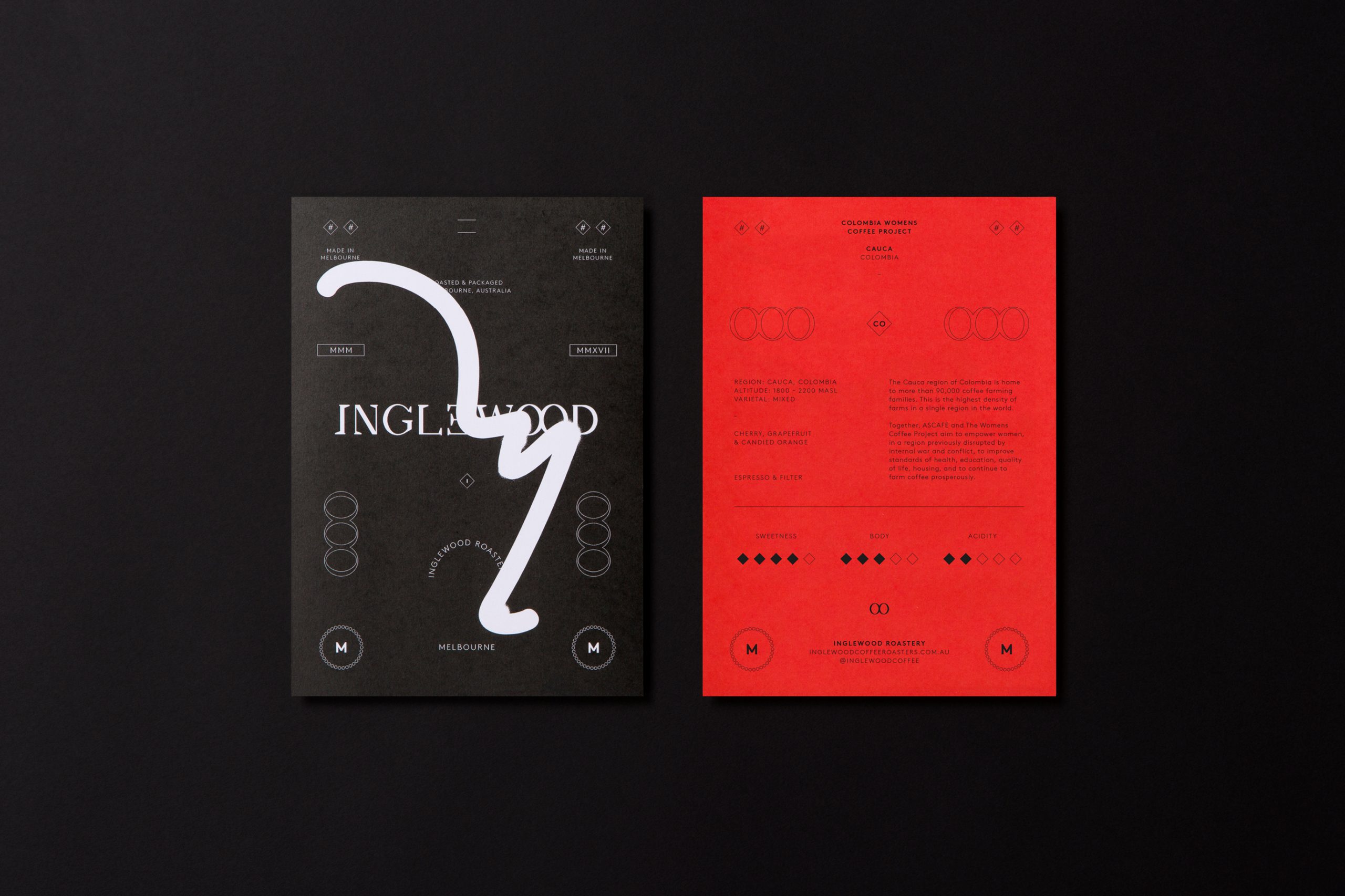
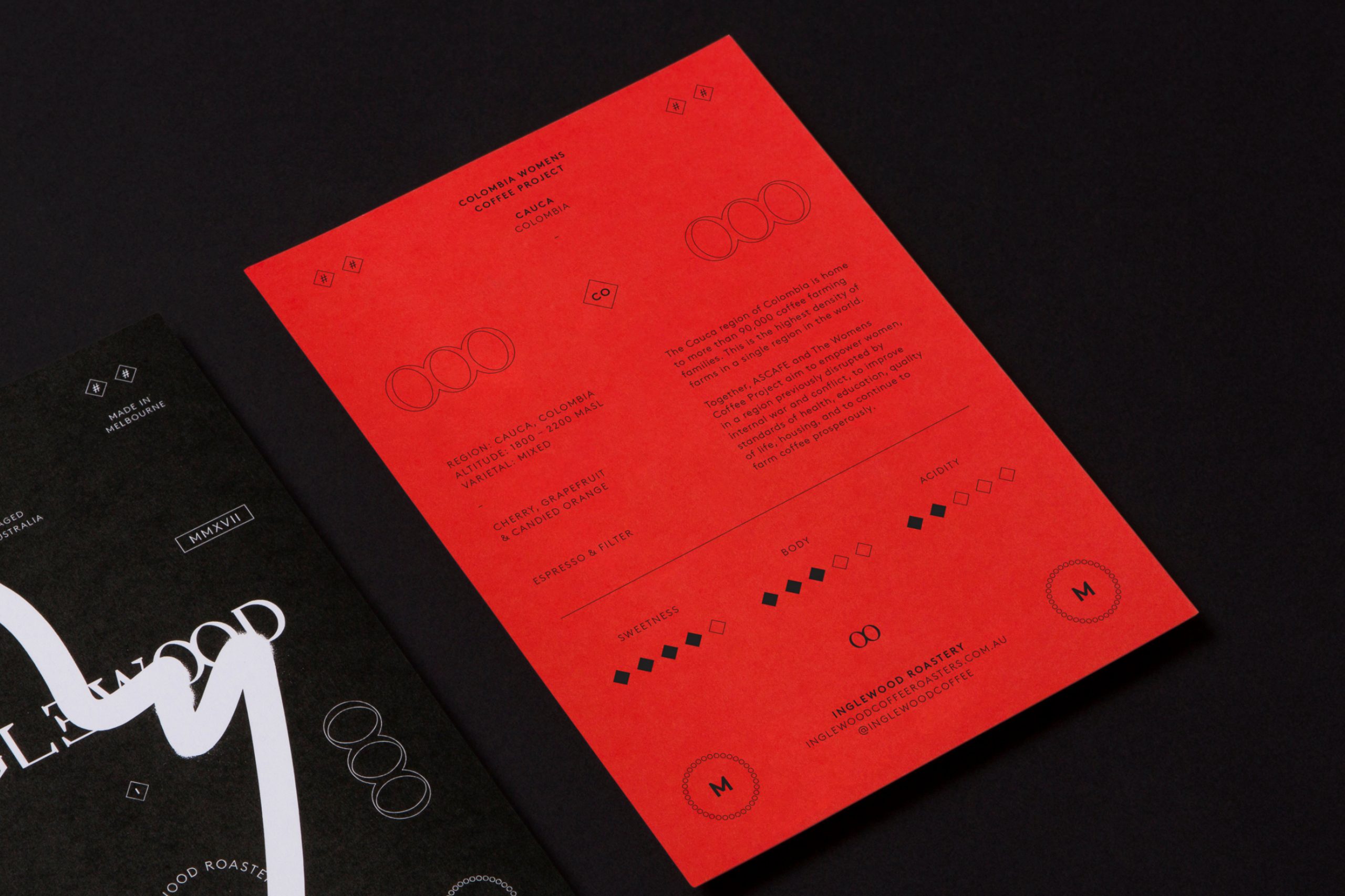
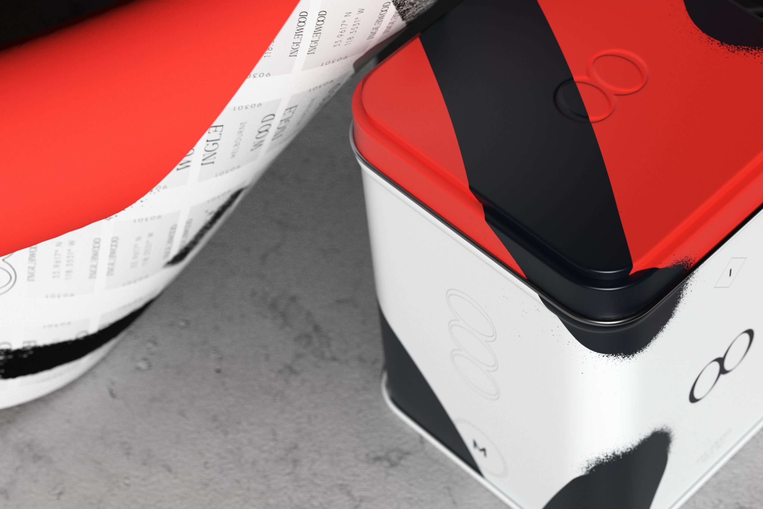
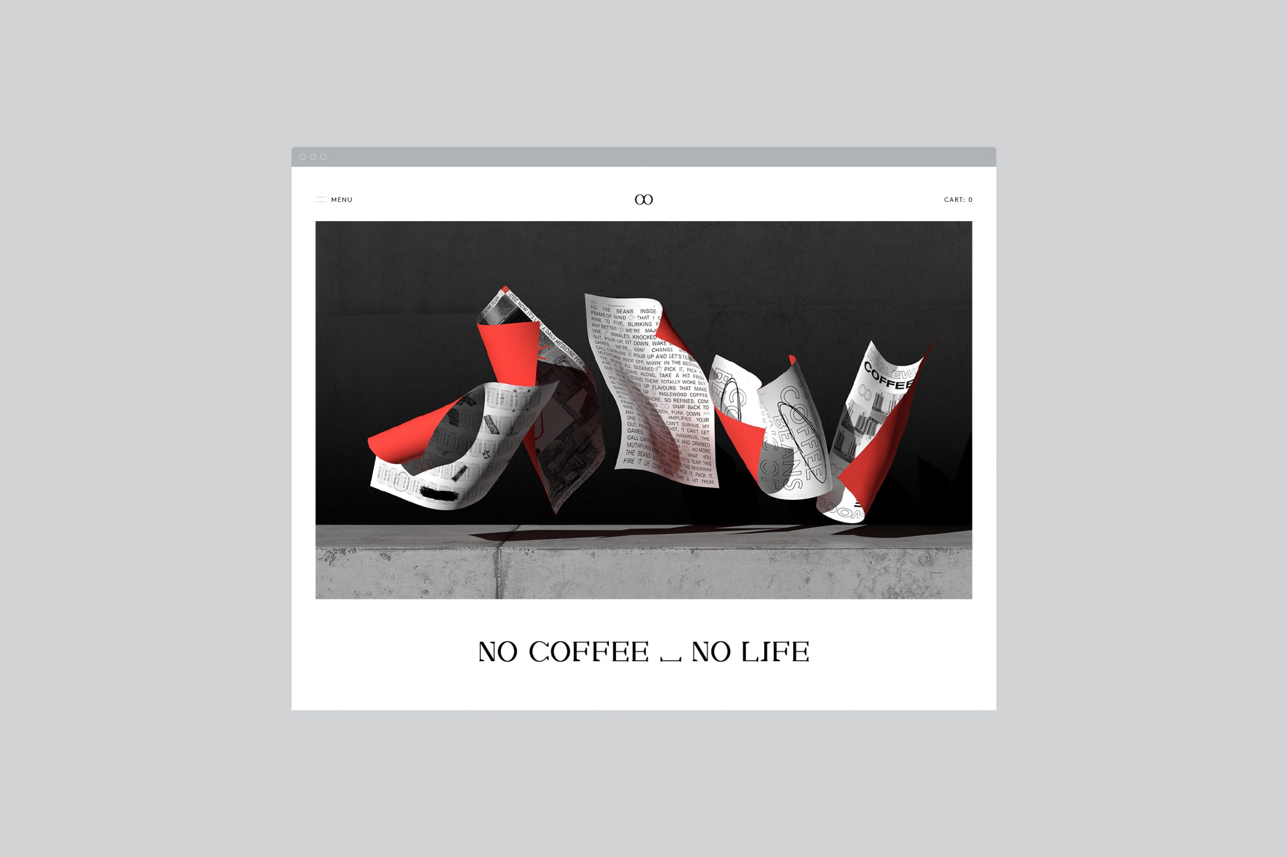
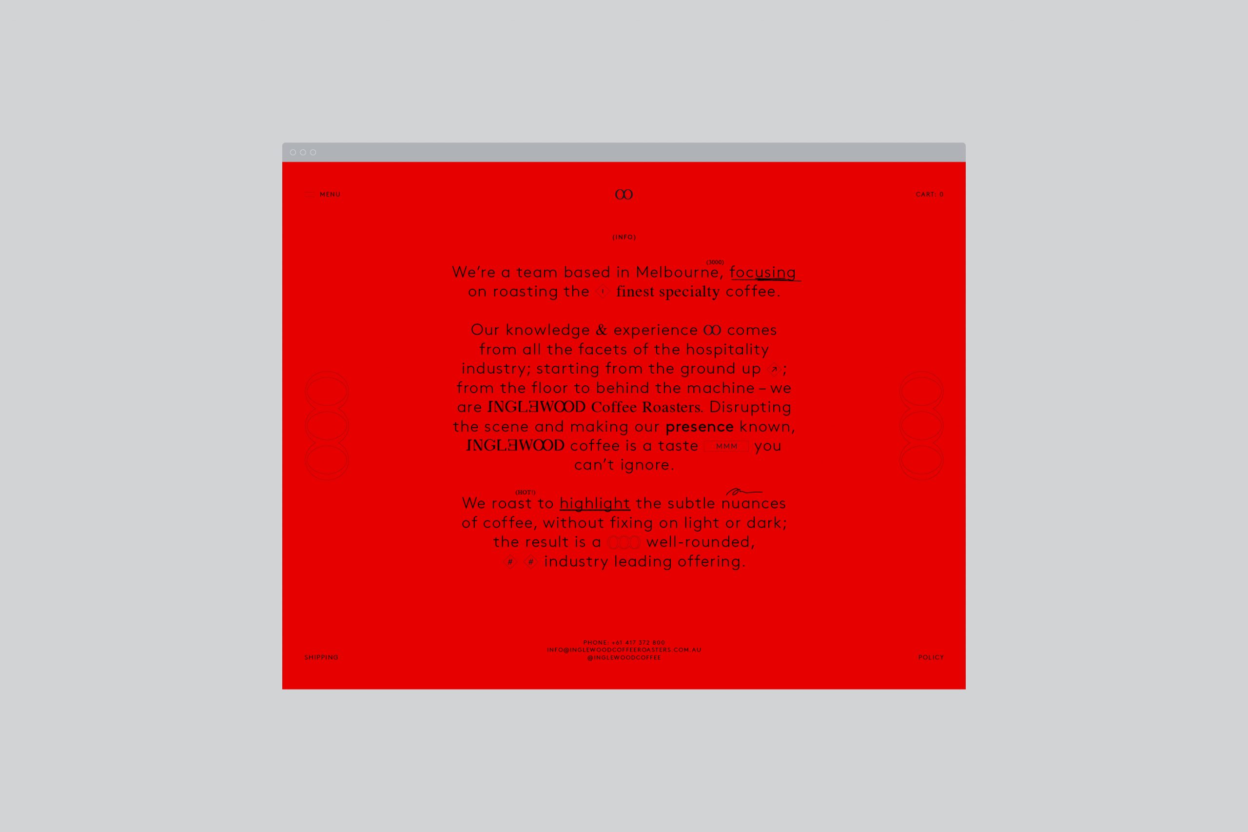
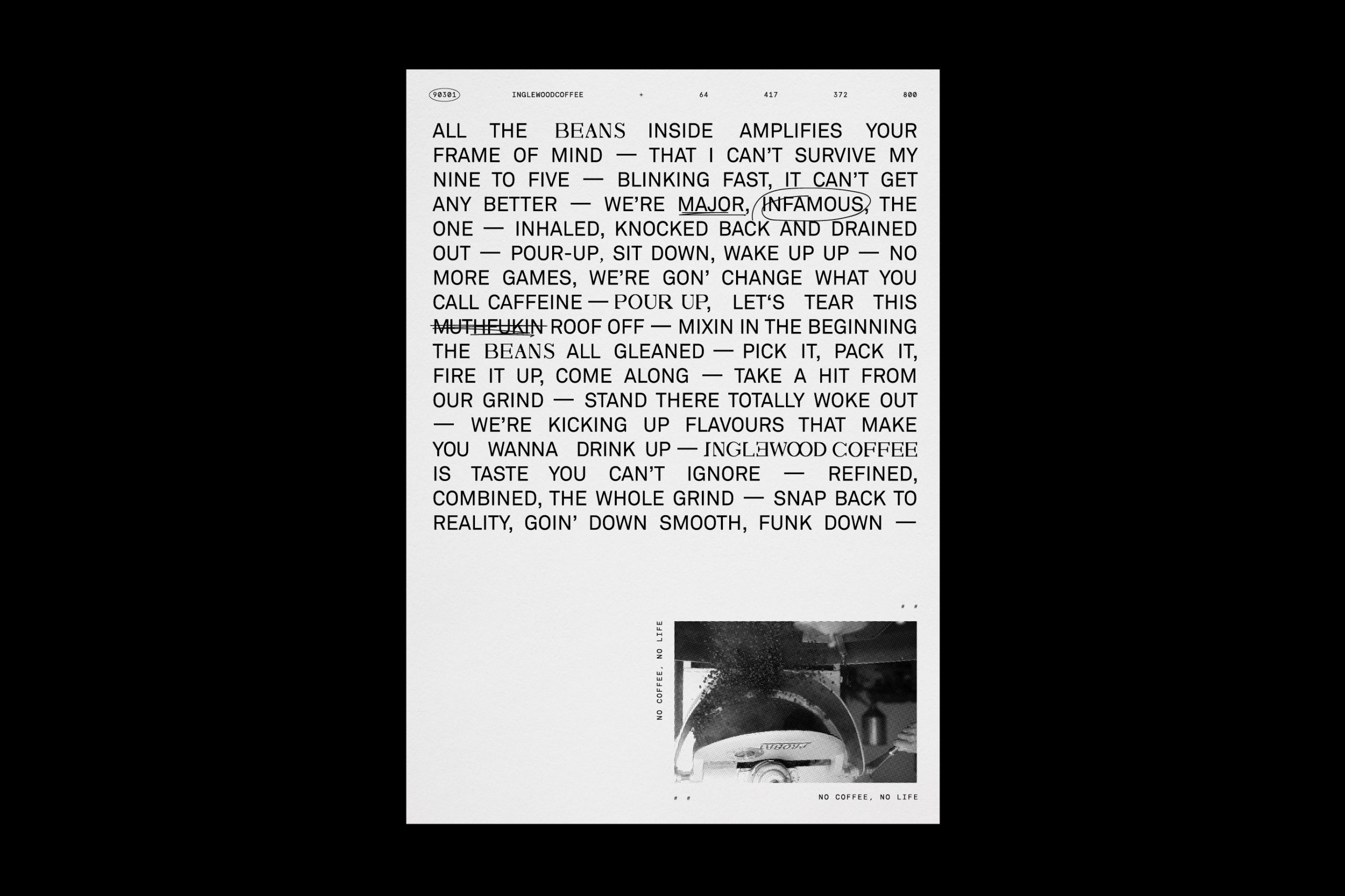
No one ever became known without turning heads. Where the tallest skyscraper is Randy’s Donuts, the space between Hawthorne and Fox Hills. Posters and paint litter the streets. This is where we come from. Disrupting the scene and making our presence known, Inglewood coffee is a taste you can’t ignore. Once just faces with no names, Inglewood Roasters are emerging as the new kings of coffee.
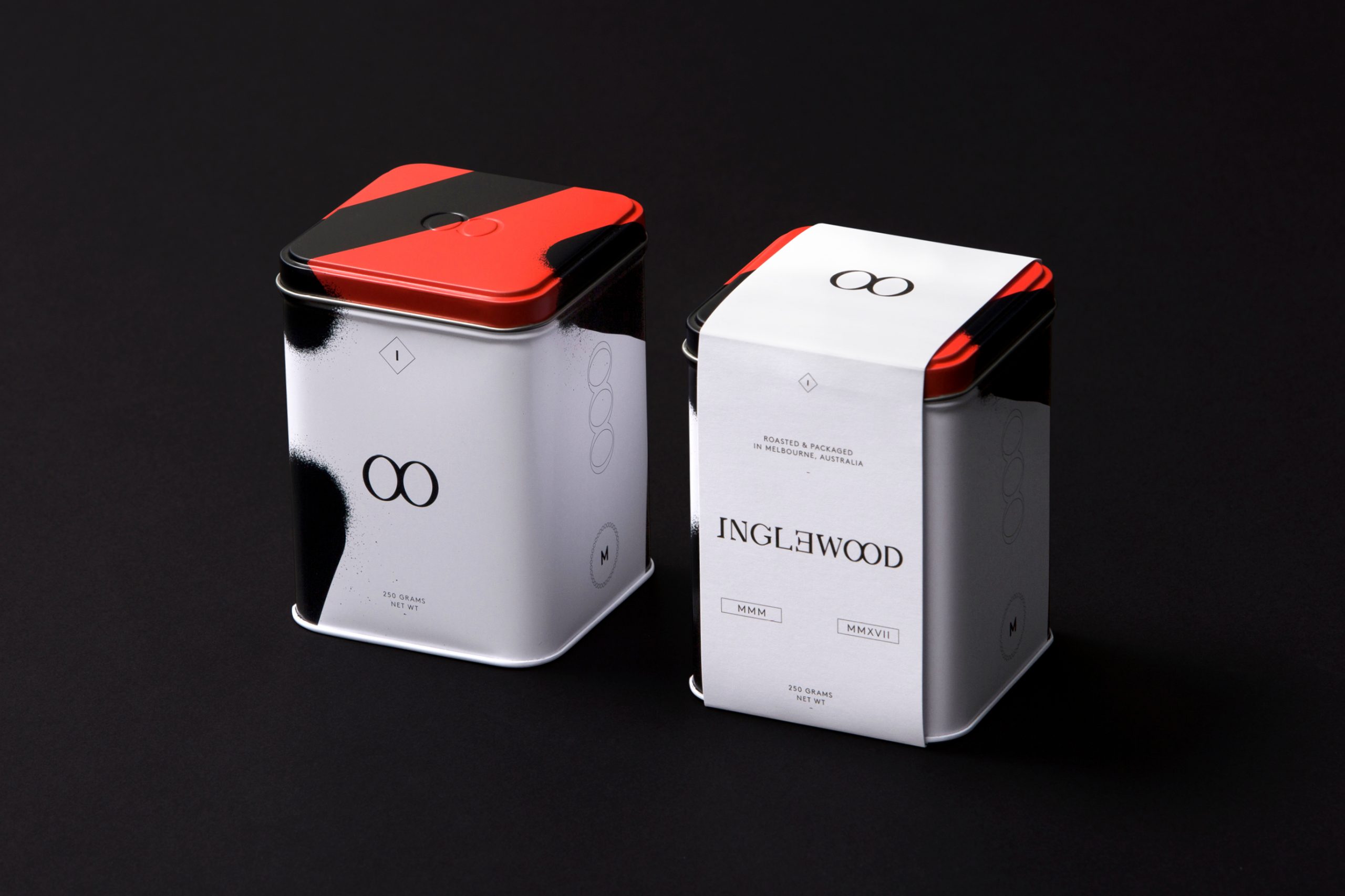
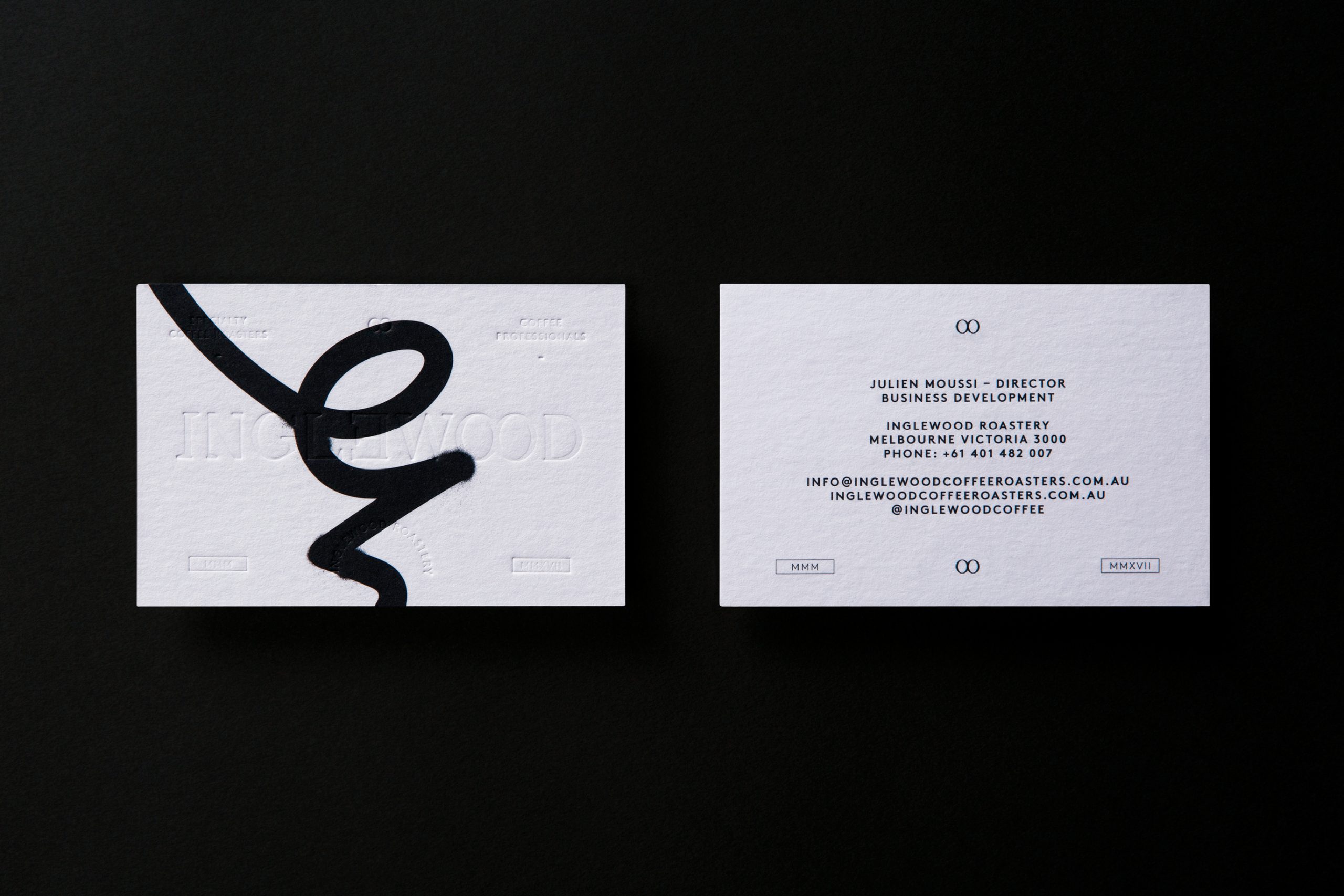
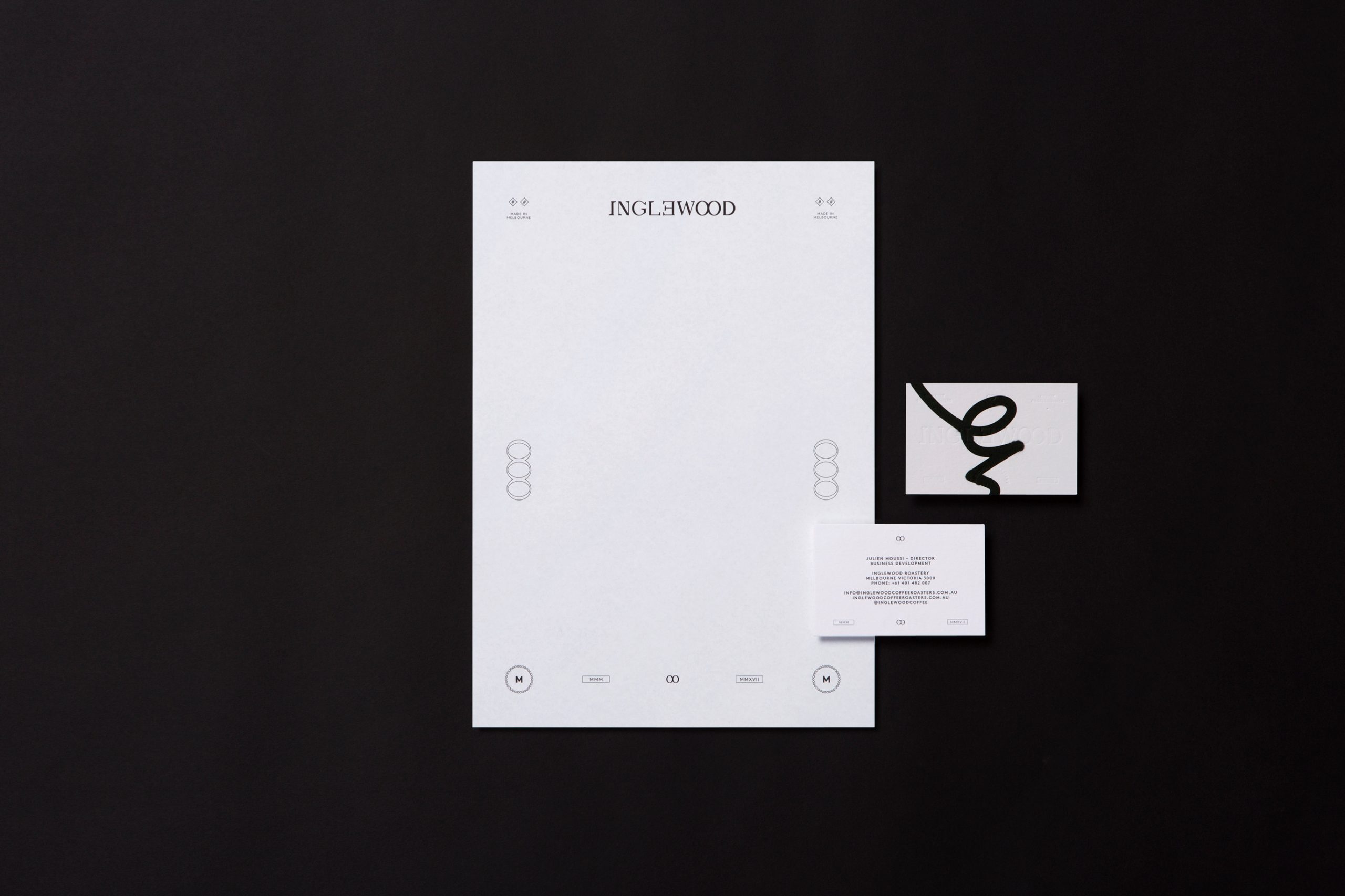
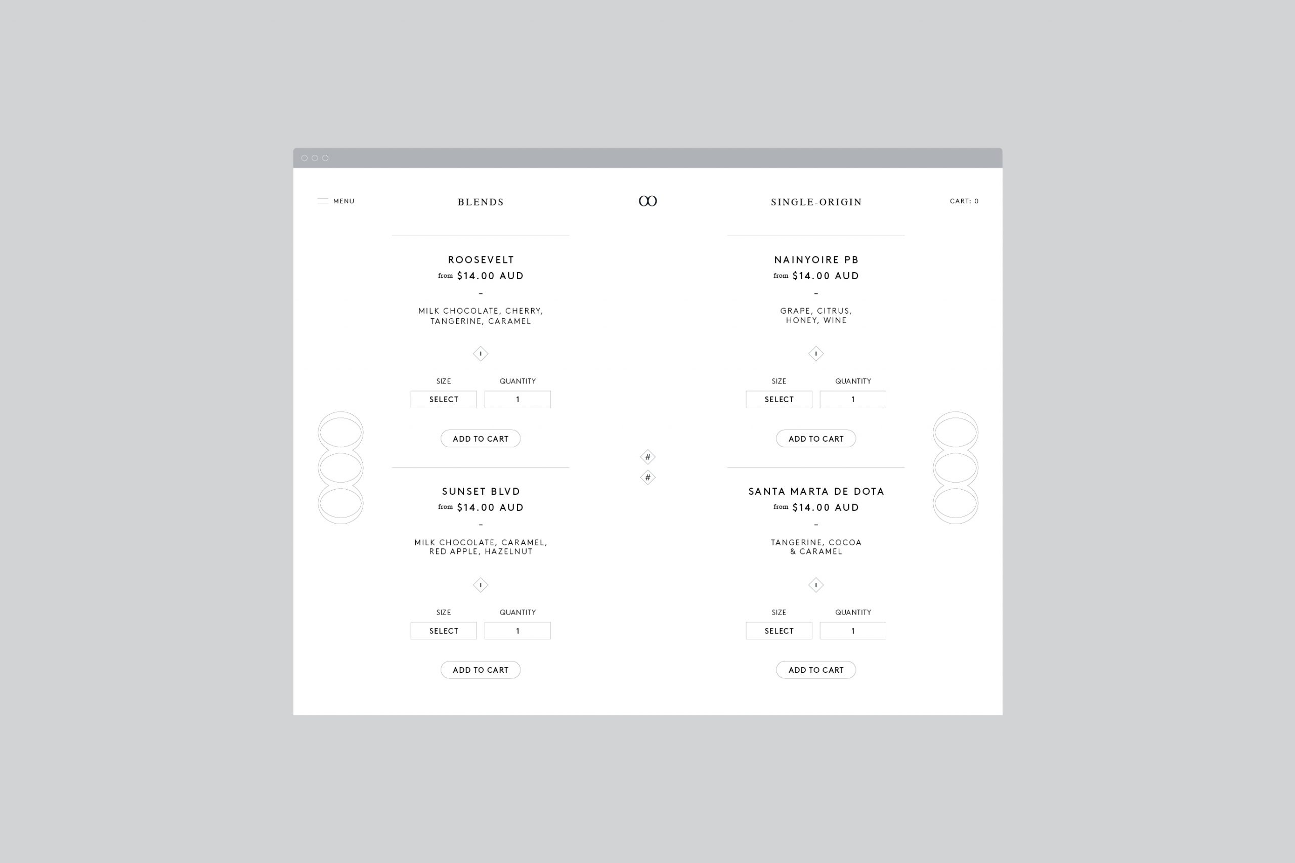
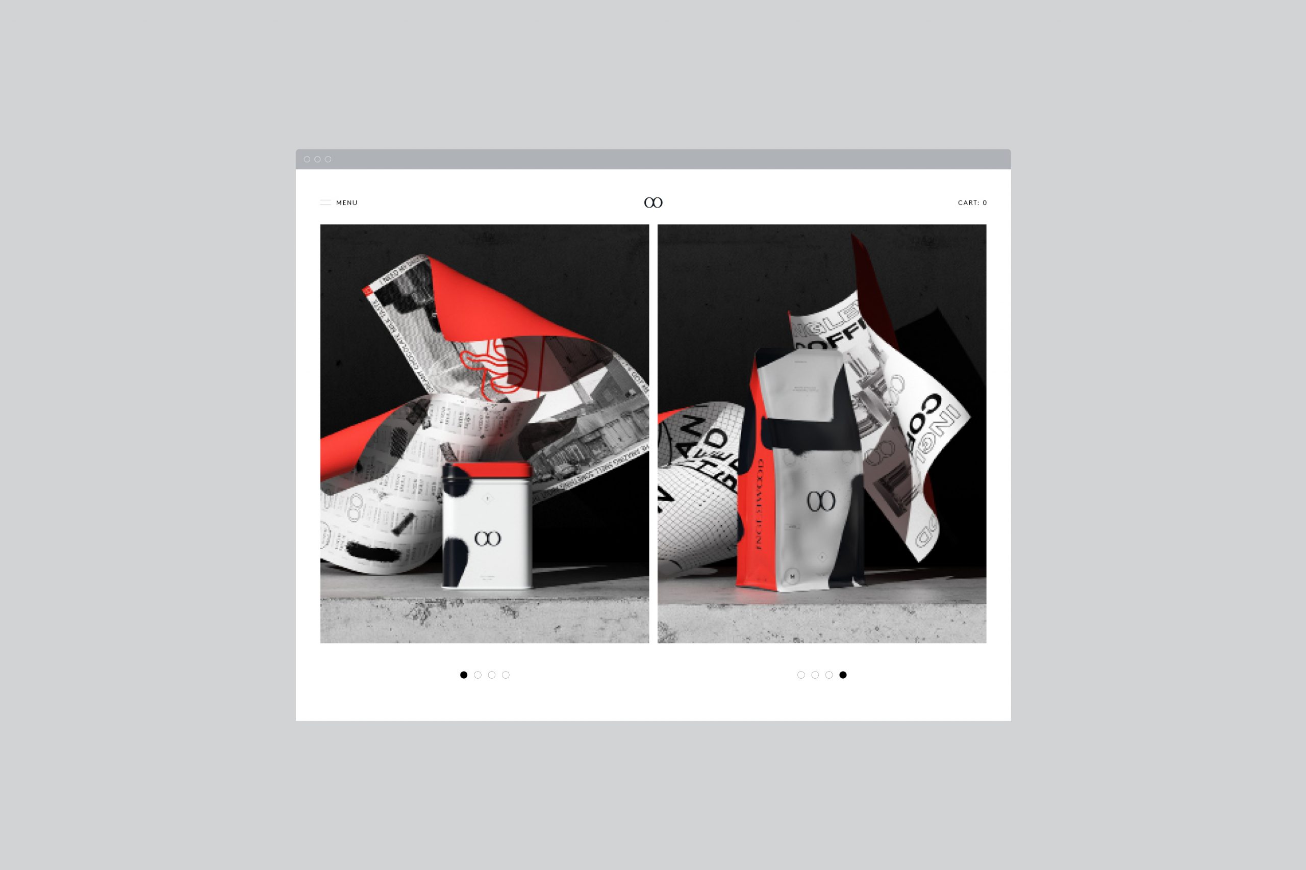
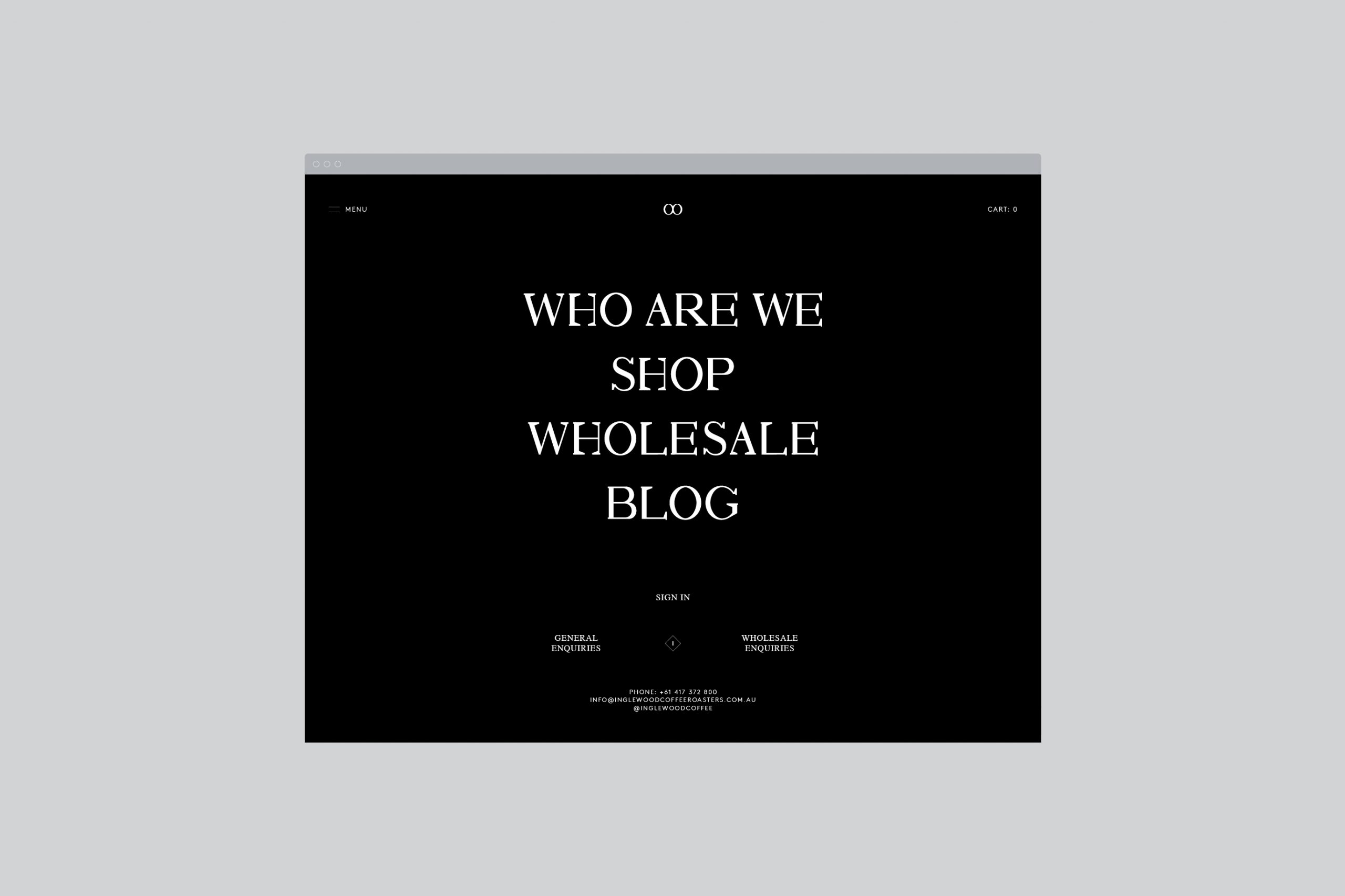
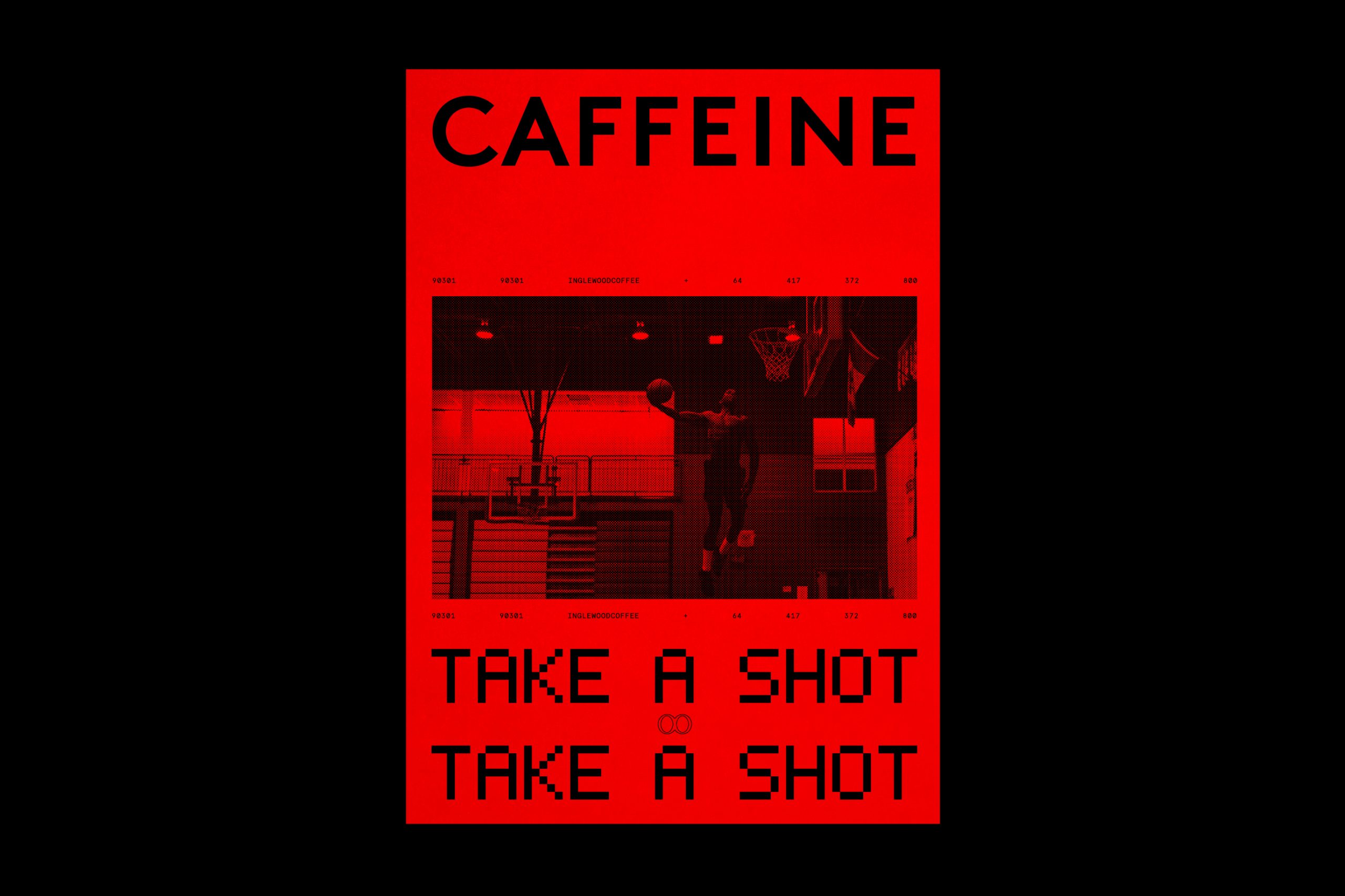
The Objective: A brand identity including collateral, signage and website design for the newest 'coffee' kid in town.
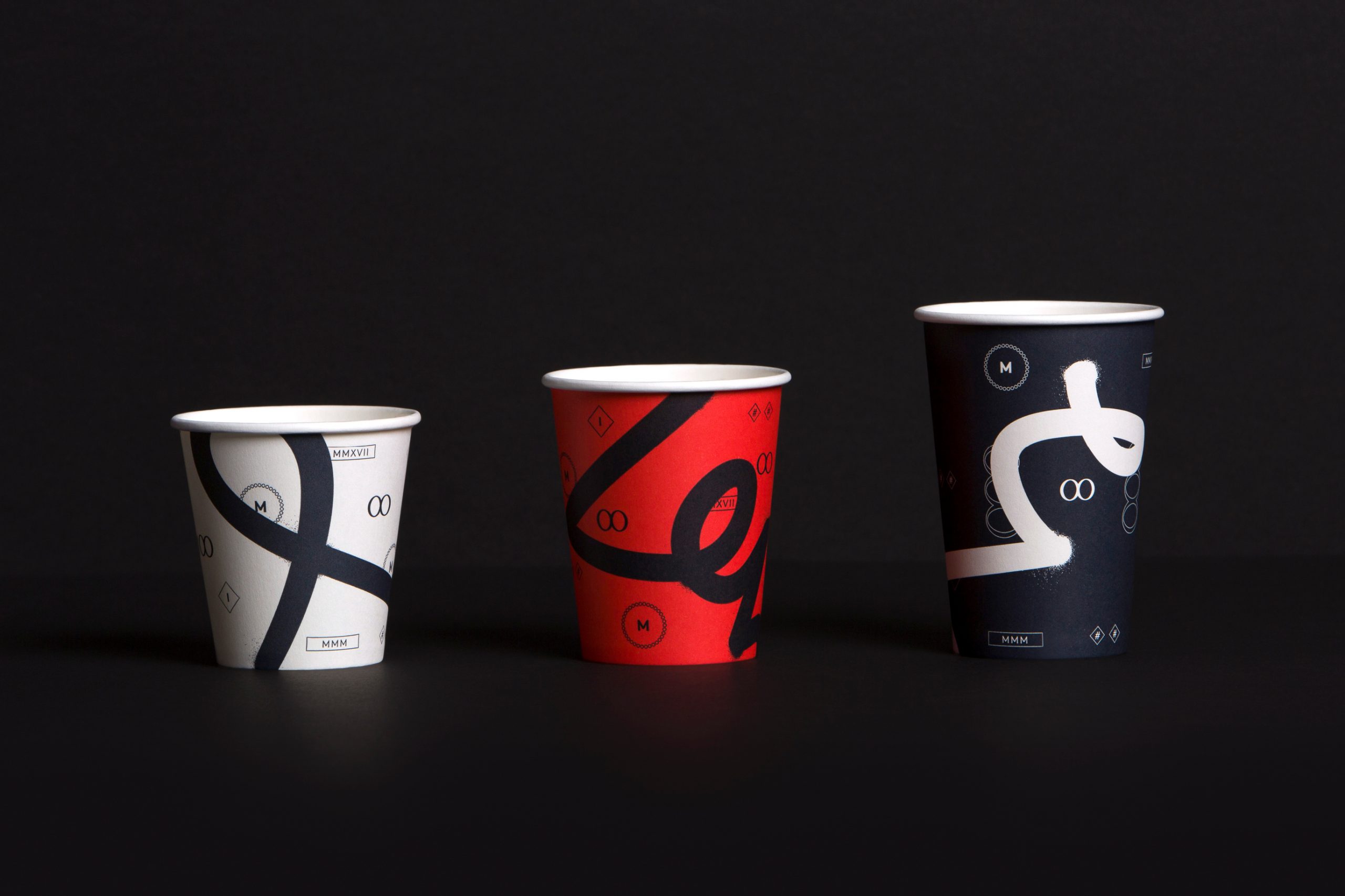
The Opportunity: To create a bold, brave visual identity with serious street cred for a new coffee raoster looking to disrupt the crowded Melbourne coffee market.
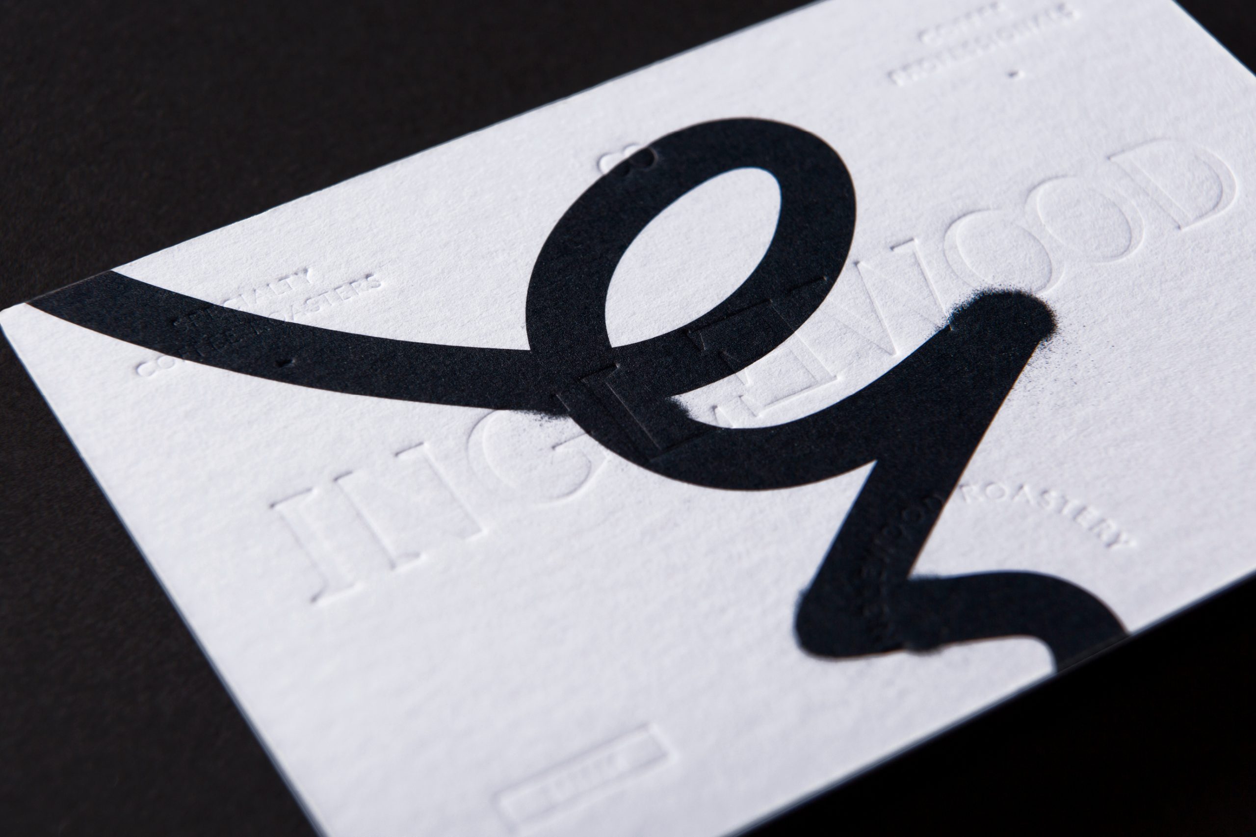
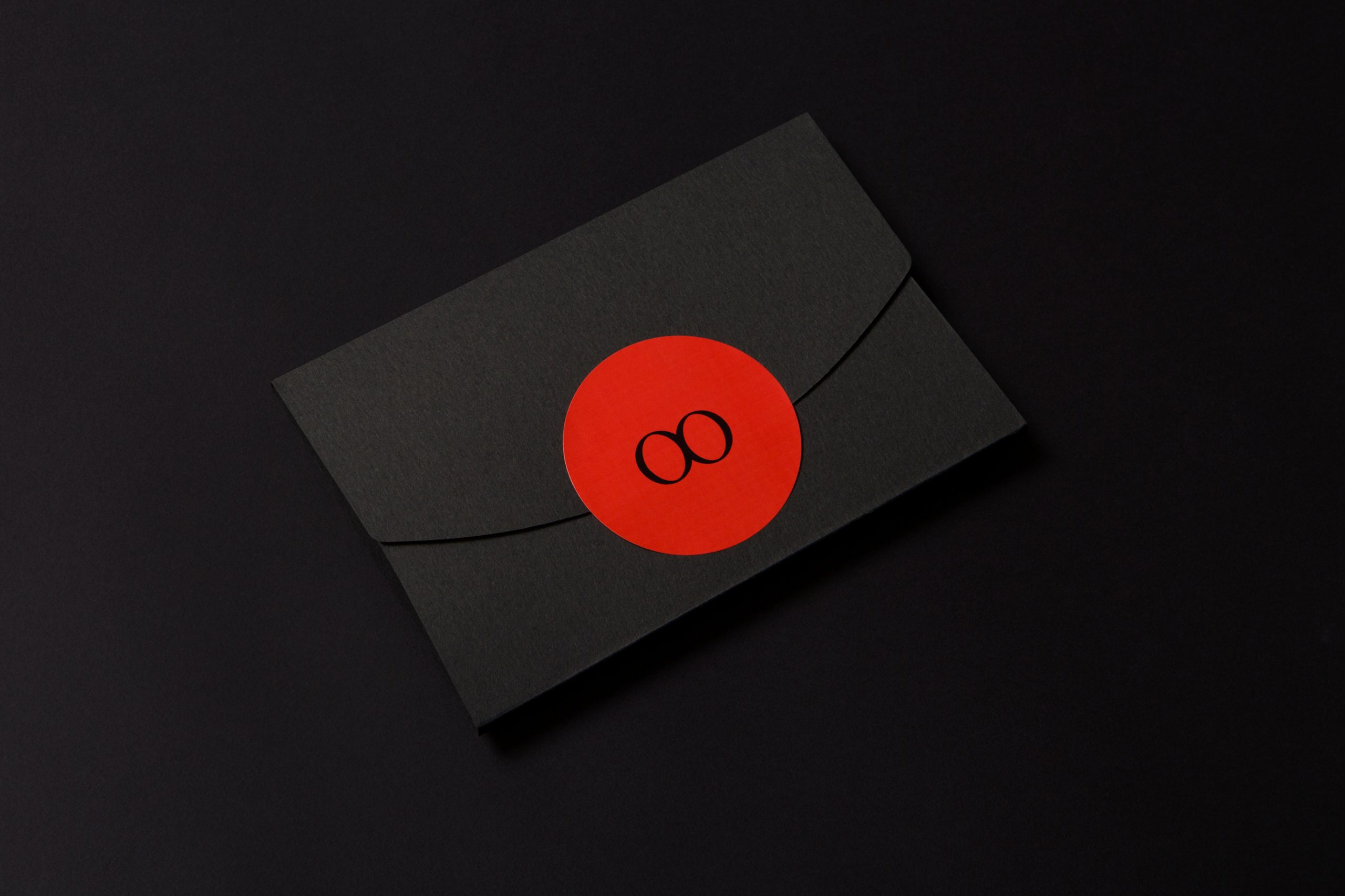
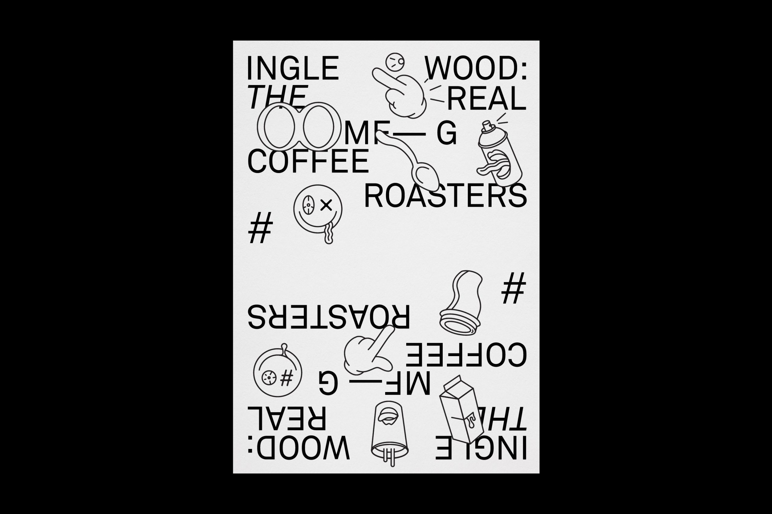
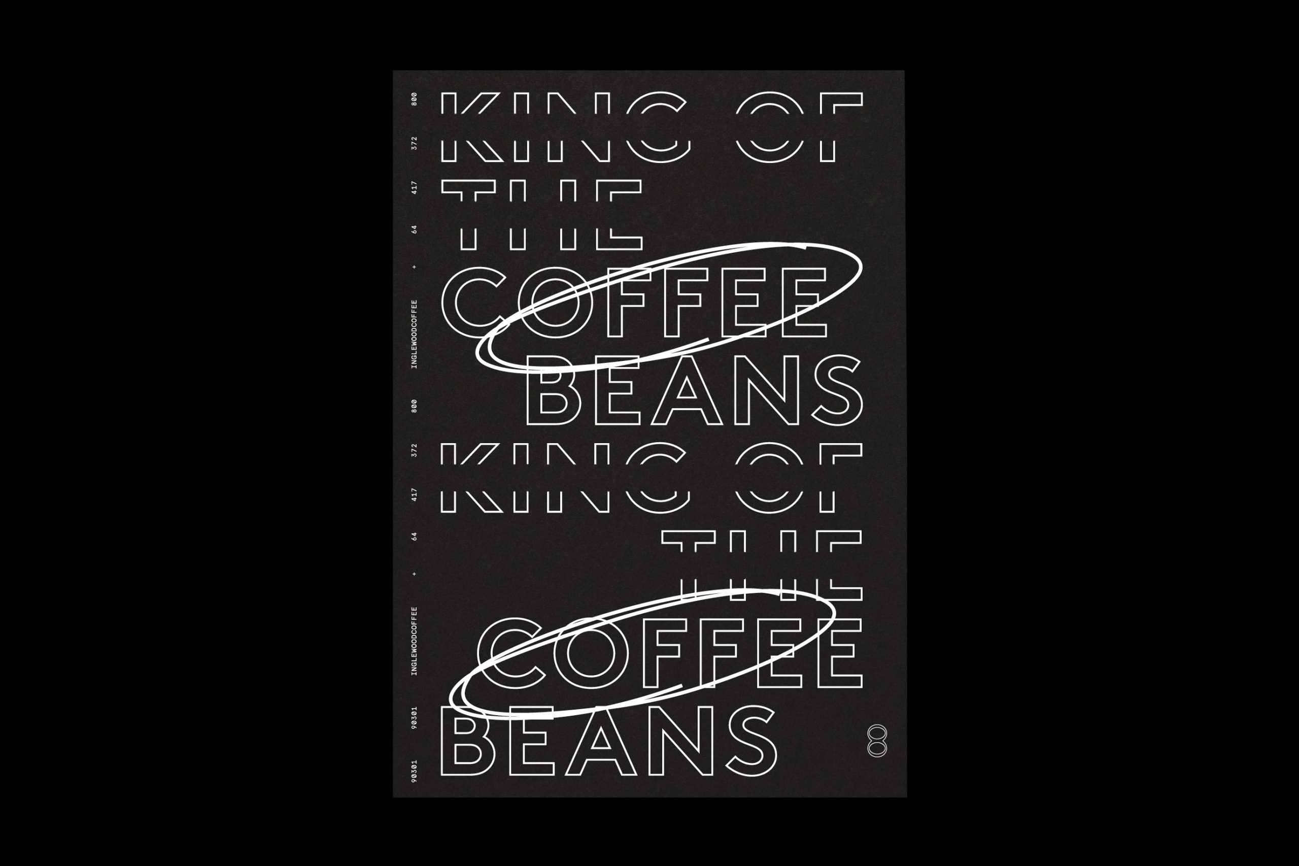
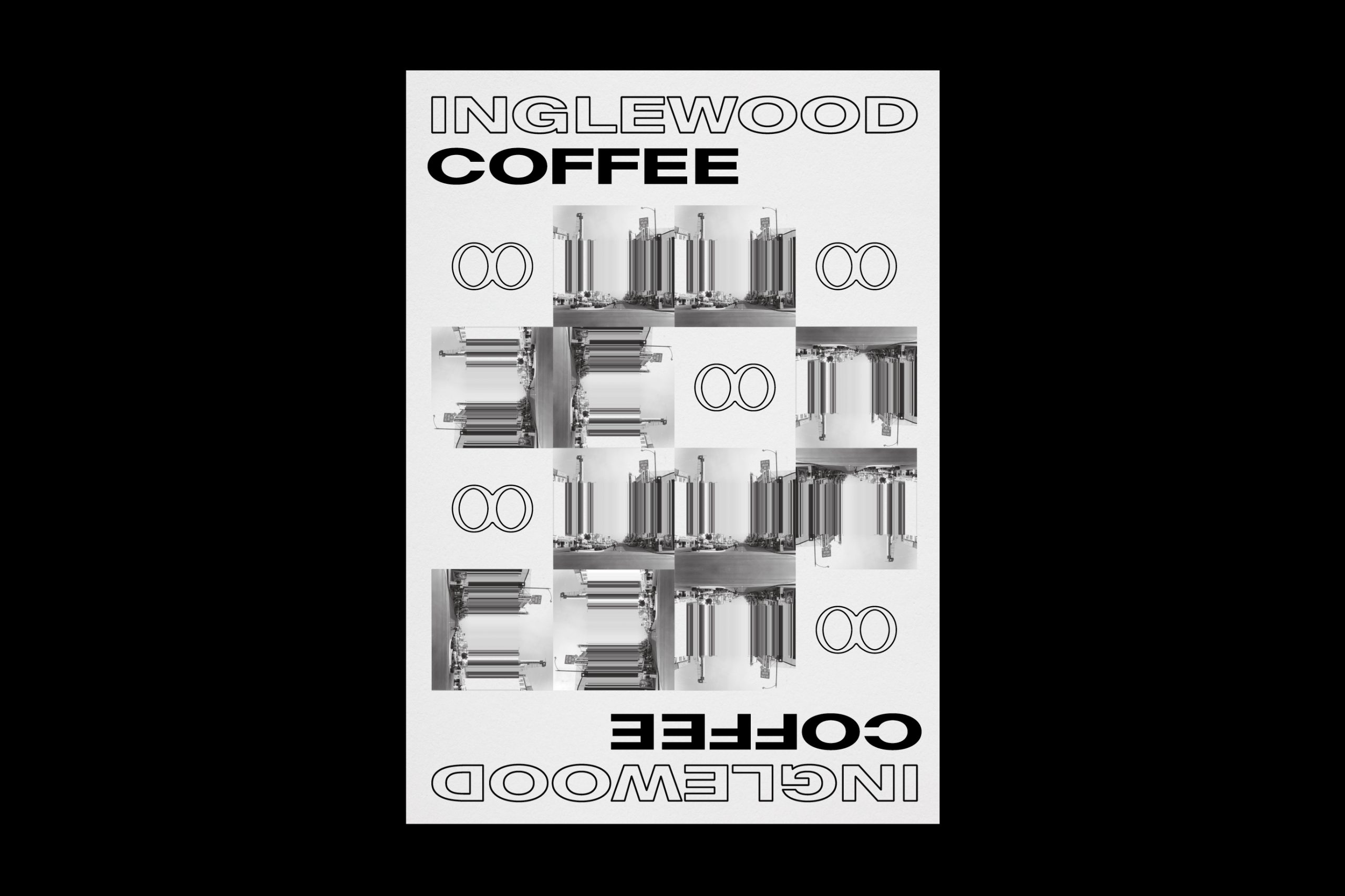
The Outcome: Our approach references street art to articulate the struggle - the effort and perseverance - it takes to create. The polished nature of the tags articulate the process of refinement – the achievement of success. The infinity symbol is used throughout to articulate that Inglewood is a name not to be forgotten.
Credits:
Campaign Visualisation by 3D2D
Packaging Production by O'Kelly Group
Photography (Collateral) by Foliolio
Printing Collateral by Gunn & Taylor
Campaign Visualisation by 3D2D
Packaging Production by O'Kelly Group
Photography (Collateral) by Foliolio
Printing Collateral by Gunn & Taylor
