Project:
Huxtaburger
Key Message:
Smash a Burger,
Smash Life.
Huxtaburger
Key Message:
Smash a Burger,
Smash Life.
Sector:
Hospitality
Scope of Works:
Art Direction
Branded Environments
Brand Identity
Digital Design
Creative Strategy
Graphic Design
Packaging
Print Design
Hospitality
Scope of Works:
Art Direction
Branded Environments
Brand Identity
Digital Design
Creative Strategy
Graphic Design
Packaging
Print Design
Snapshot:
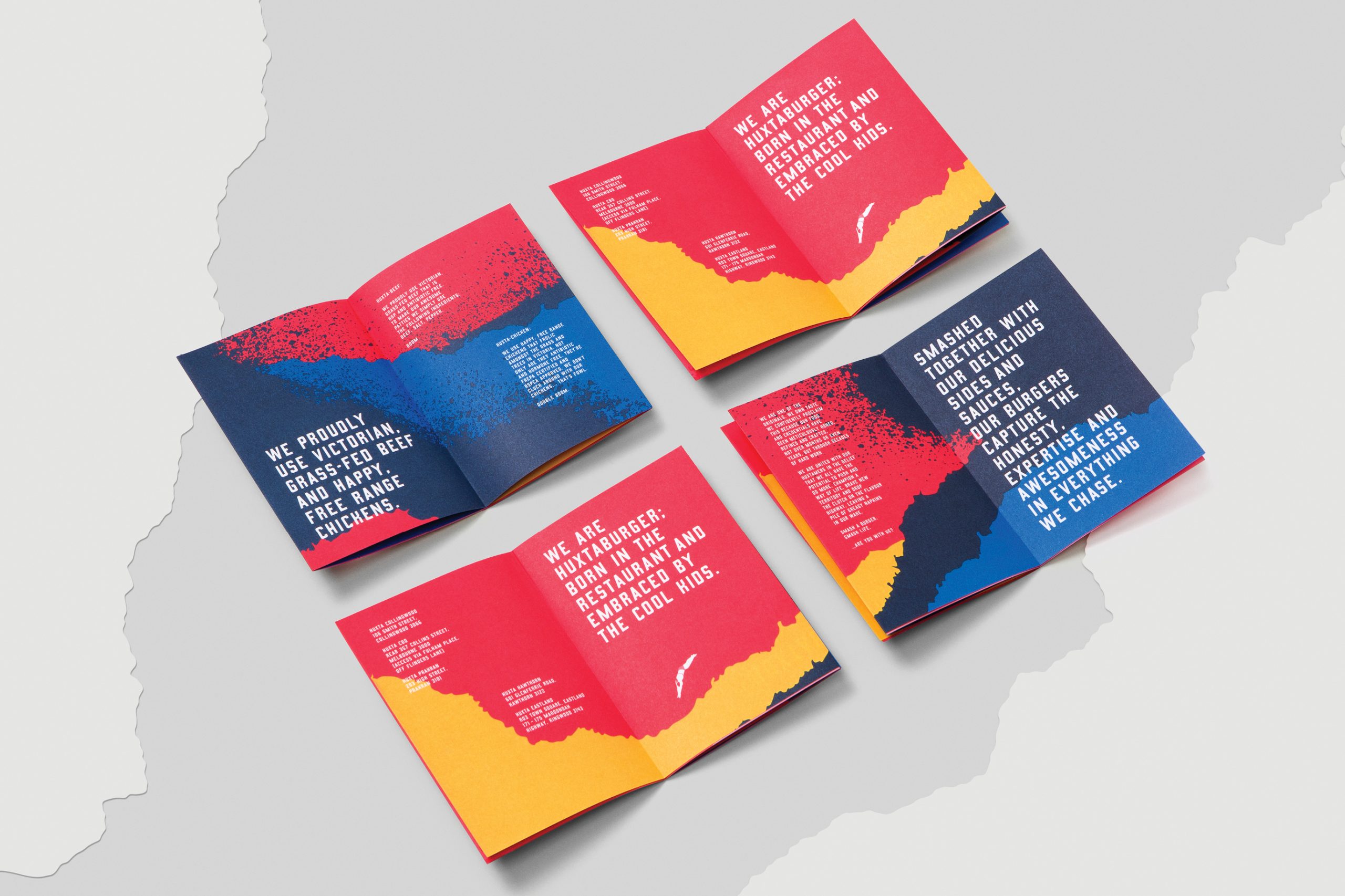
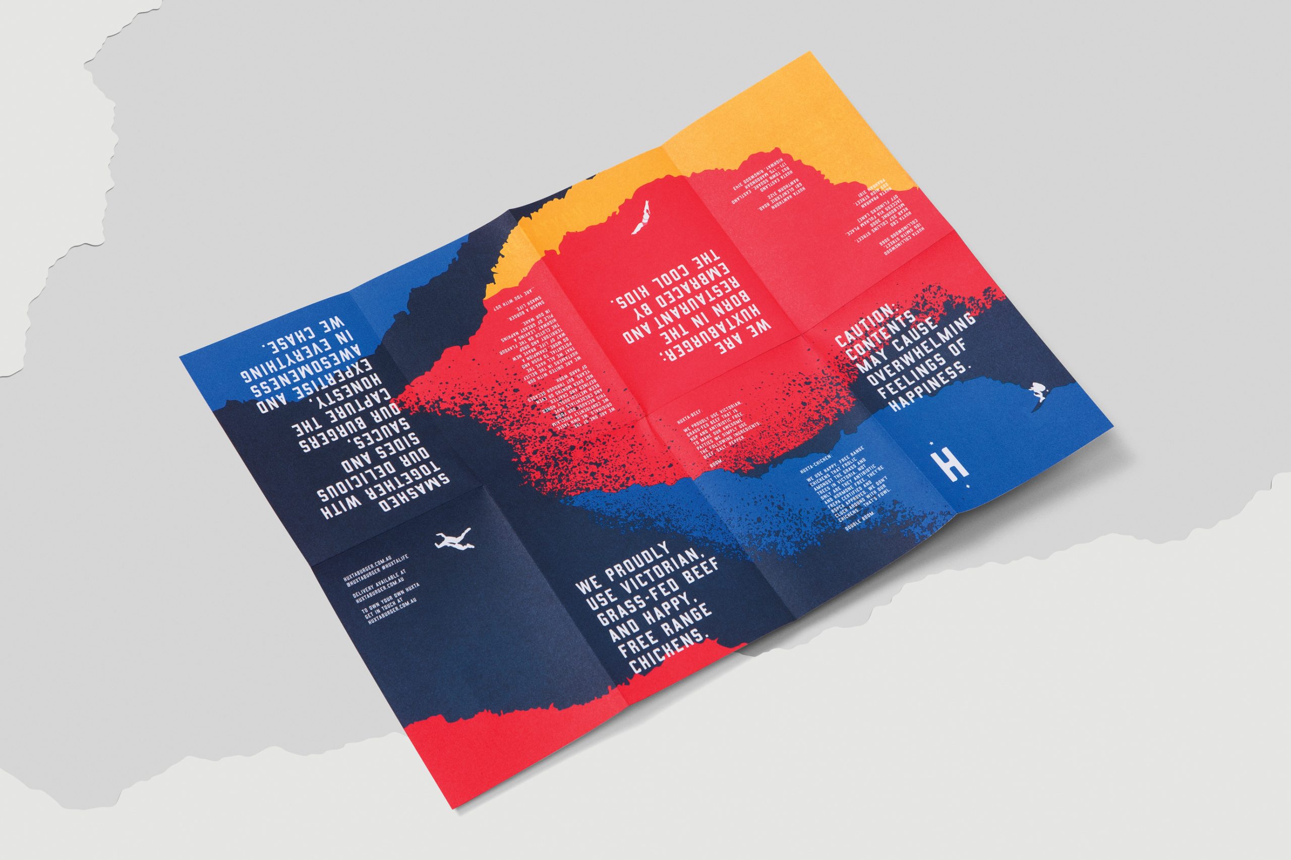
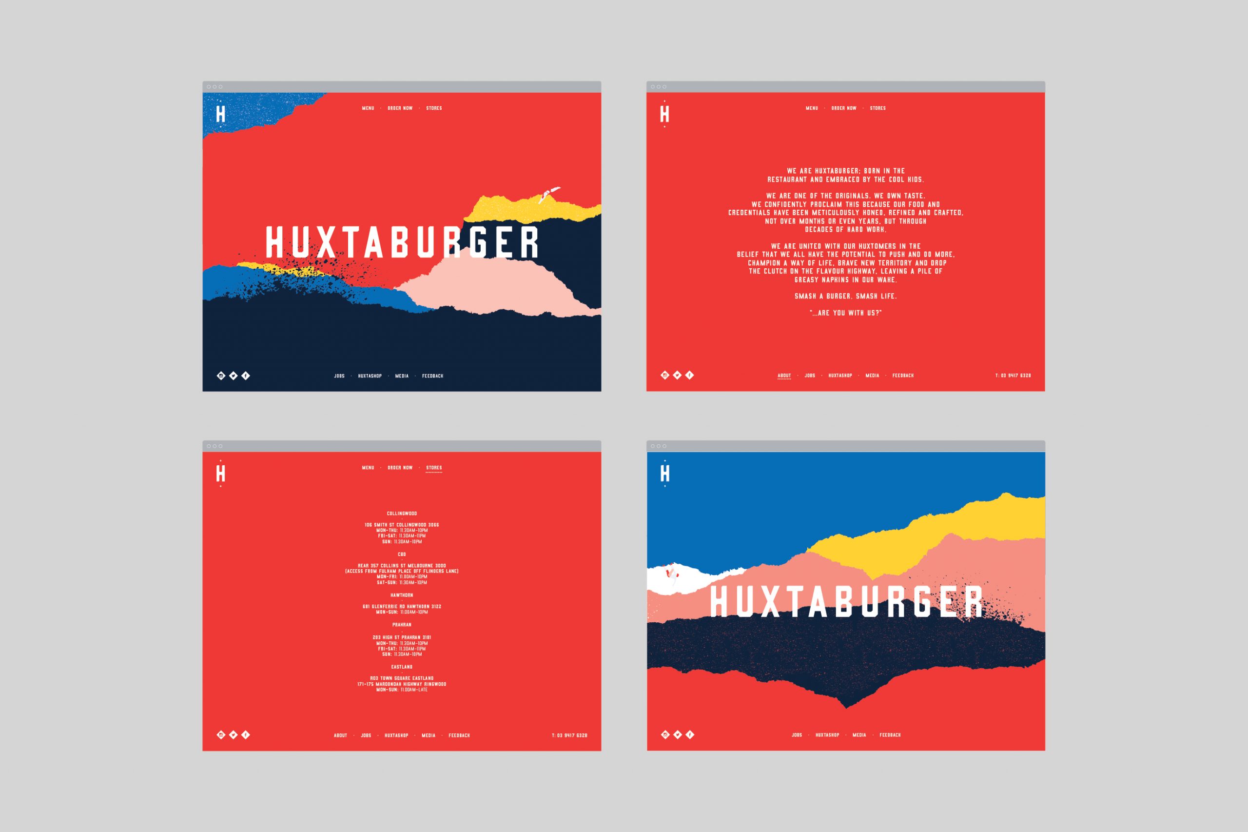
Born in the restaurant and embraced by the cool kids. We are one of the originals. WE OWN TASTE. We confidently proclaim this because our food and credentials have been meticulously honed, refined and crafted, not over months or even years, but through decades of hard work. We are united with our HUXTAMERS in the belief that we all have the potential to push AND DO more, CHAMPION A WAY OF LIFE, brave new territory and drop the clutch on the flavour highway, leaving a pile of greasy napkins in our wake. Smash a burger. Smash life. ...are you with us?
The Objective: A brand refresh to provide renewed internal confidence, allowing Huxtaburger to confidently expand its offer into a franchise model.
The Opportunity: Create a clarified brand position that clearly identified the Huxtaburger community and allowed for improved social uptake & engagement. Refine and articulate the brand story and messaging framework to capture and communicate the brand’s personality, which had previously been disconnected in visuals and voice.
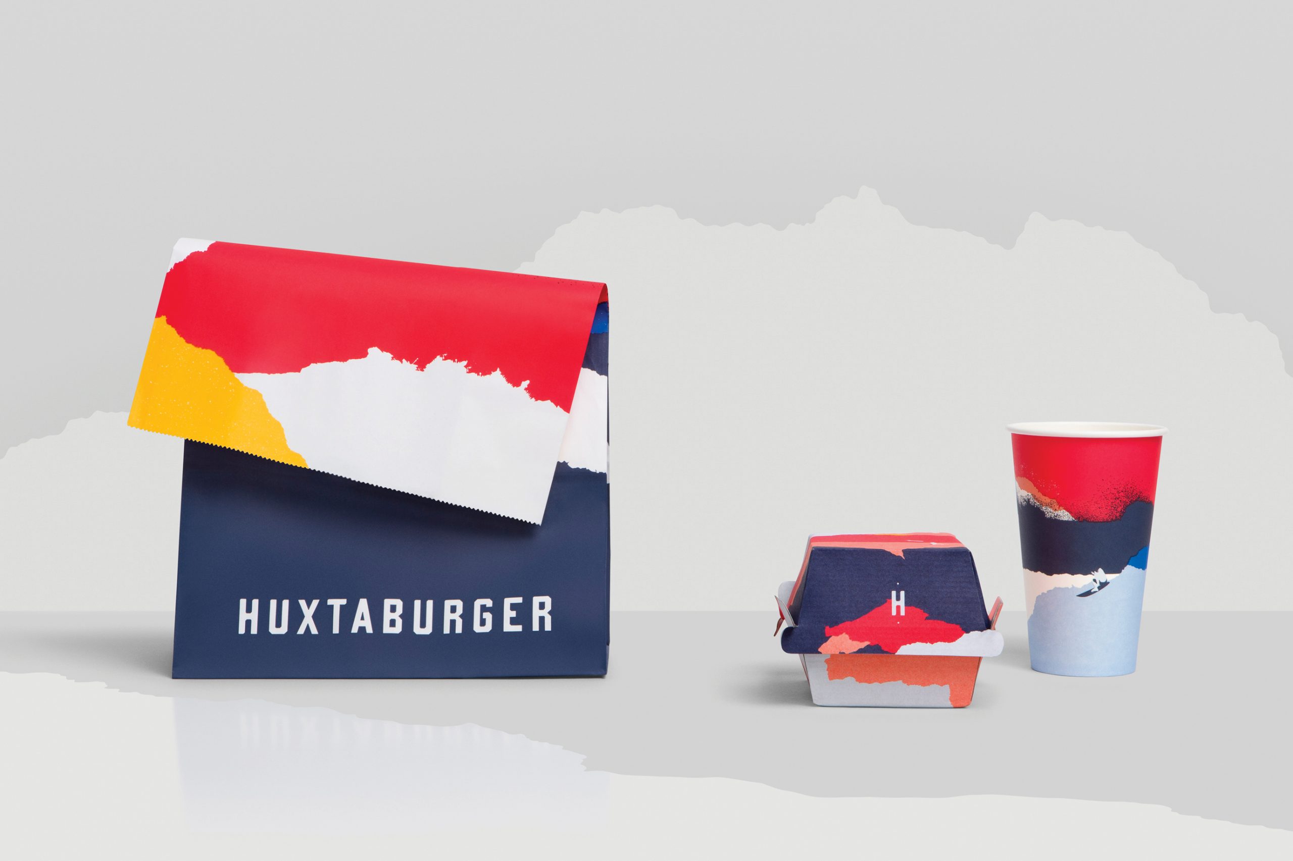
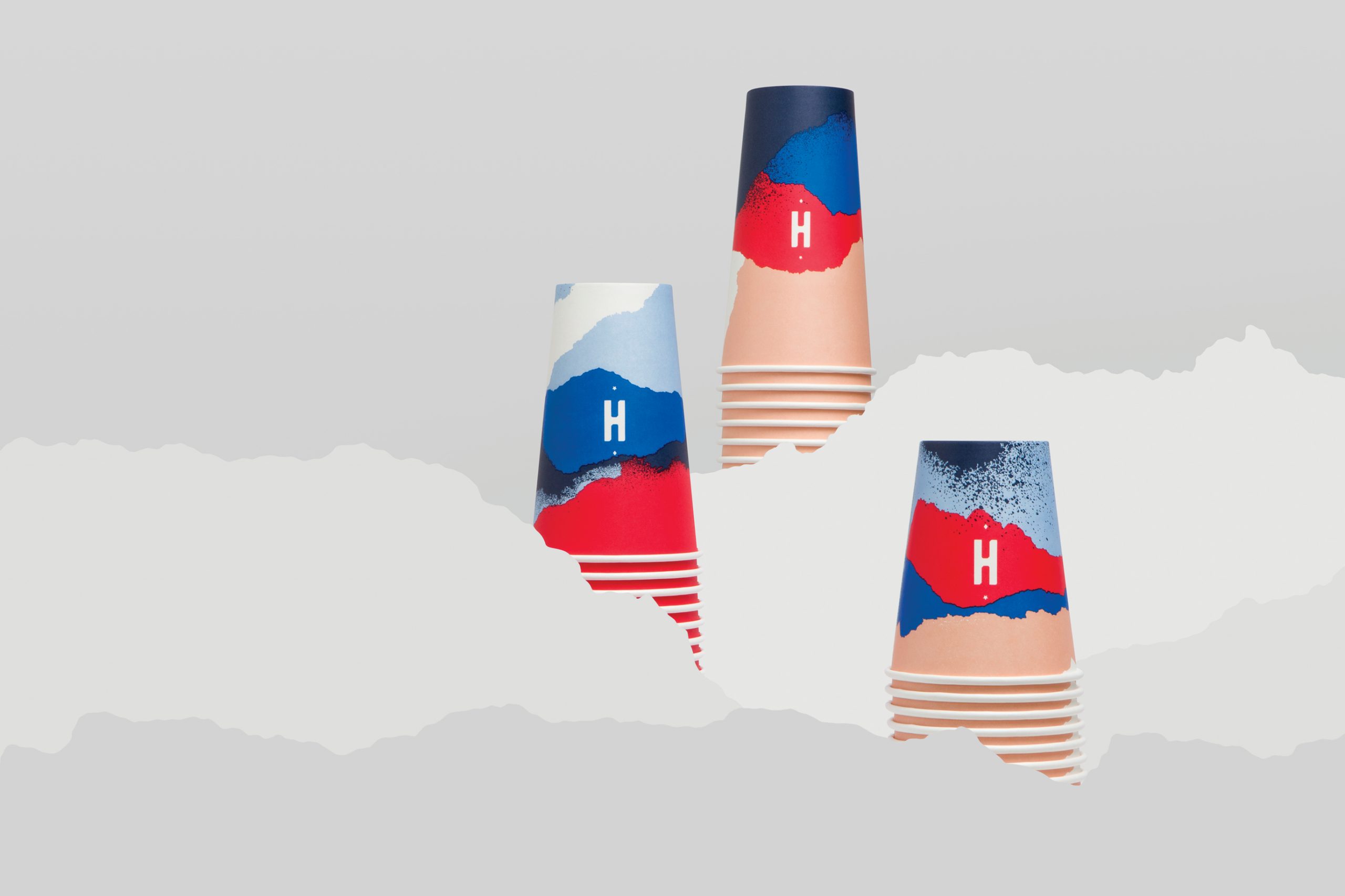
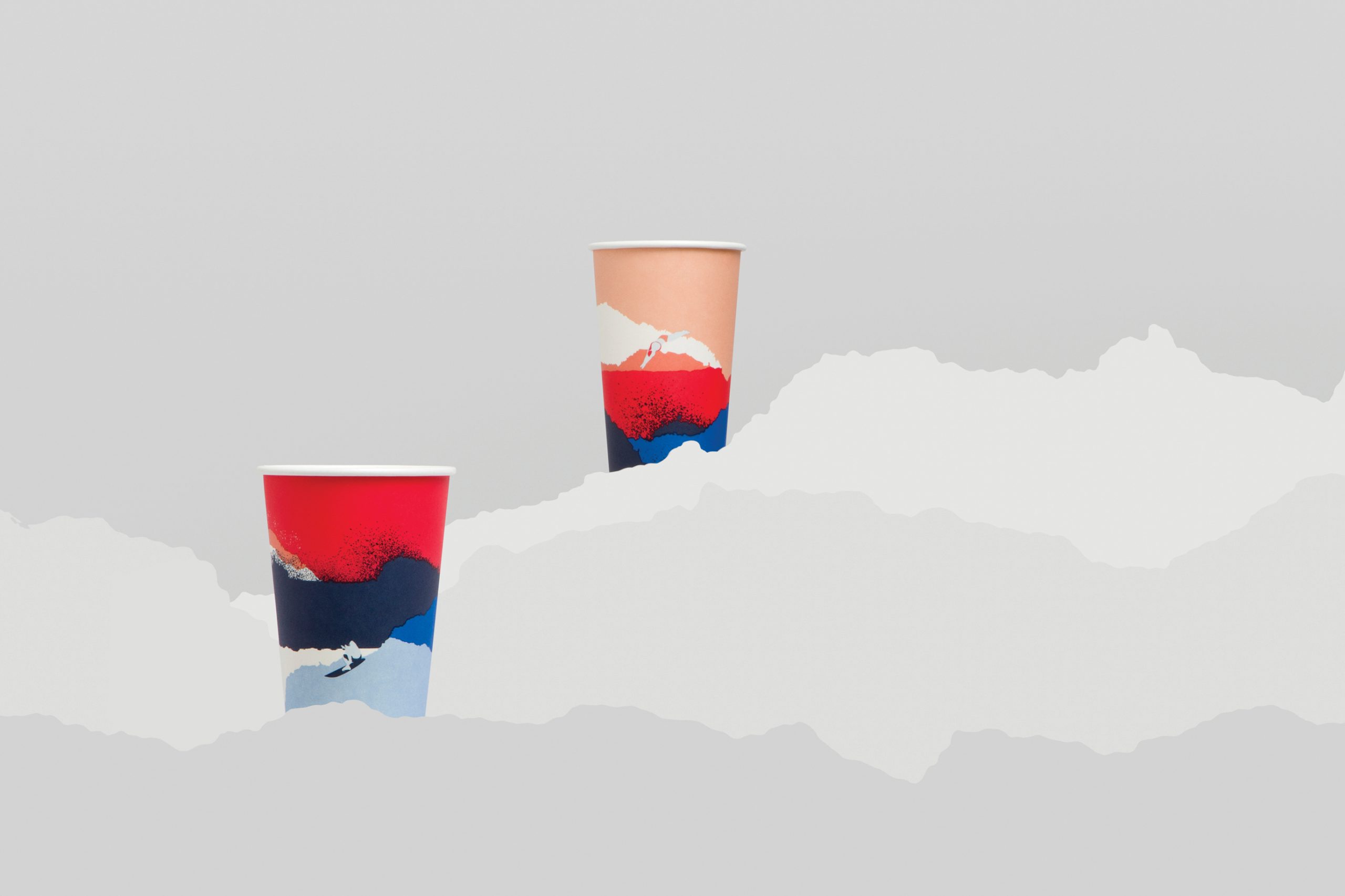
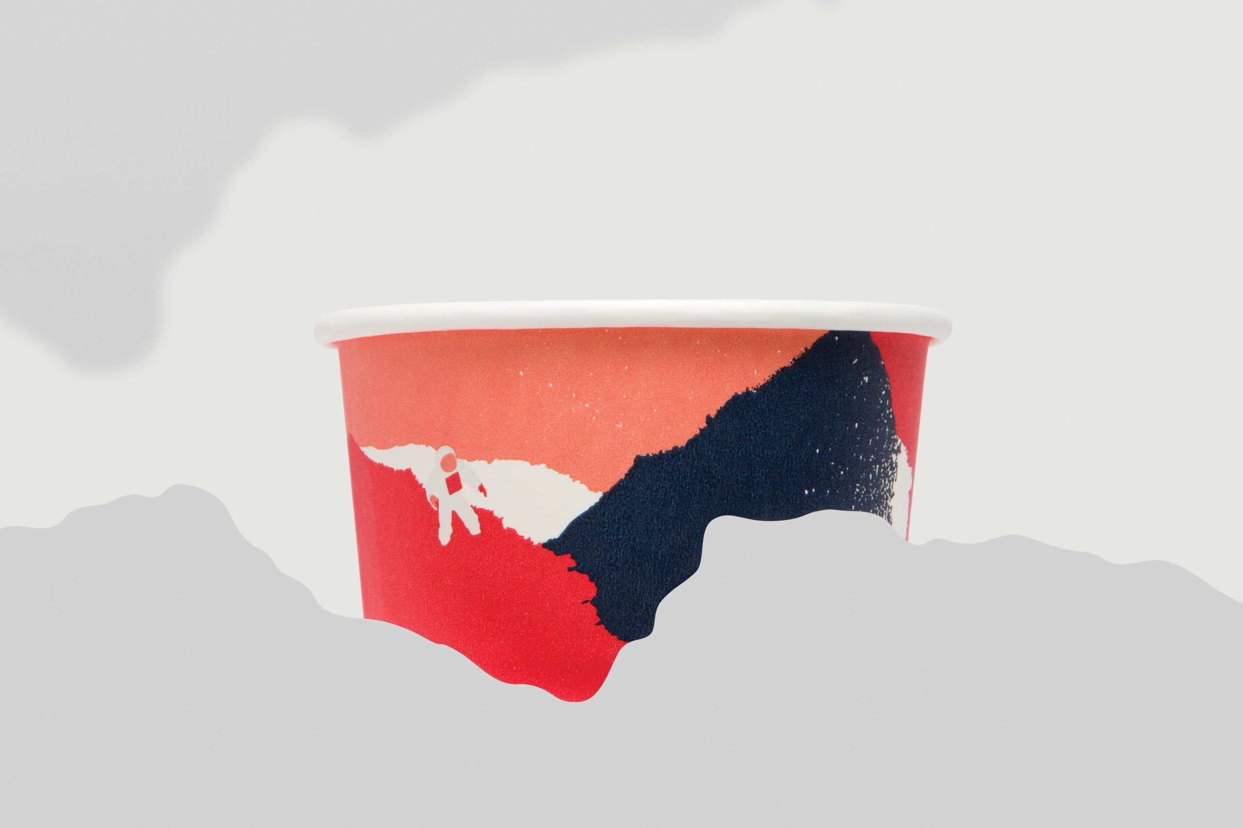
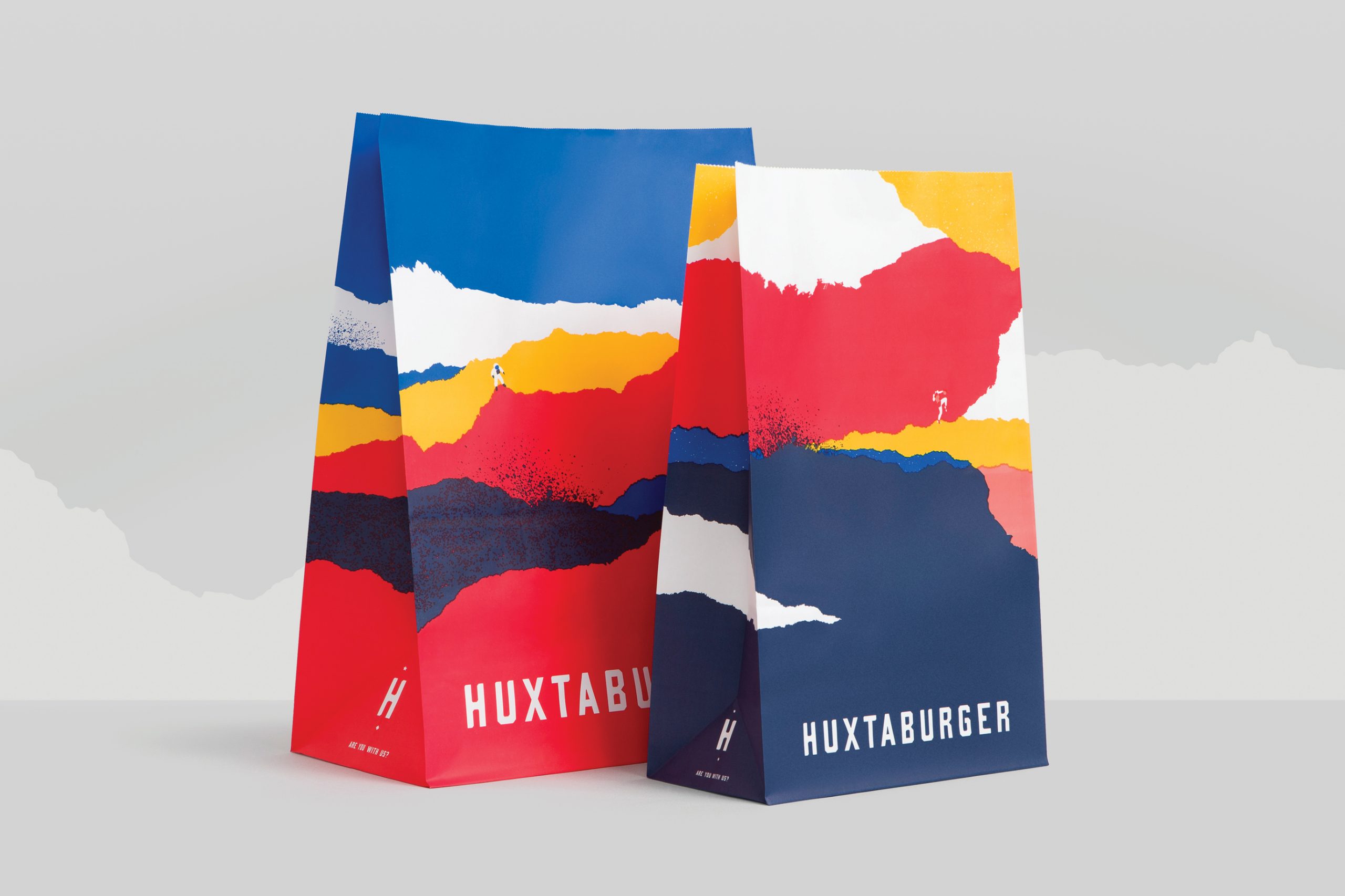
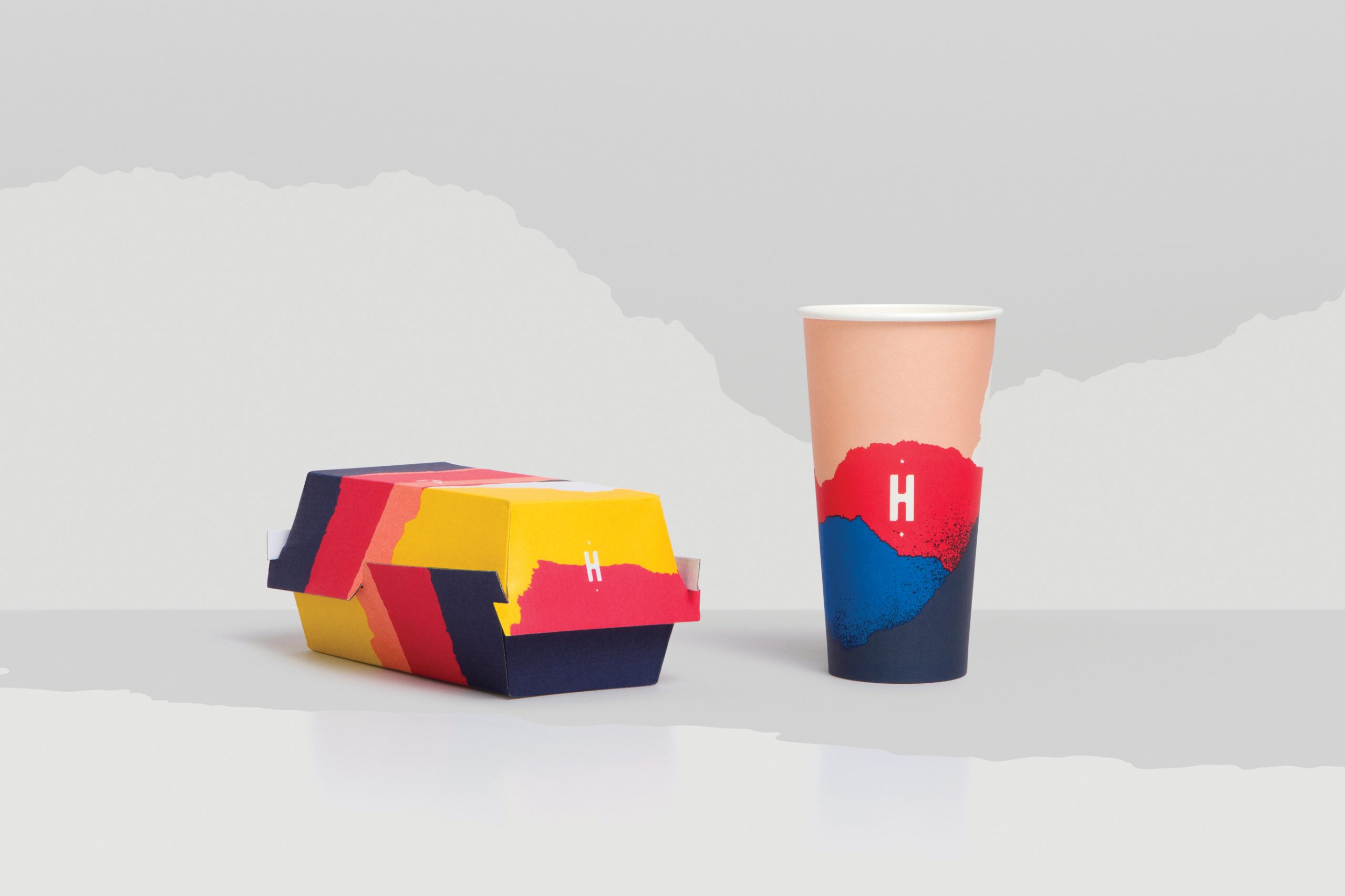
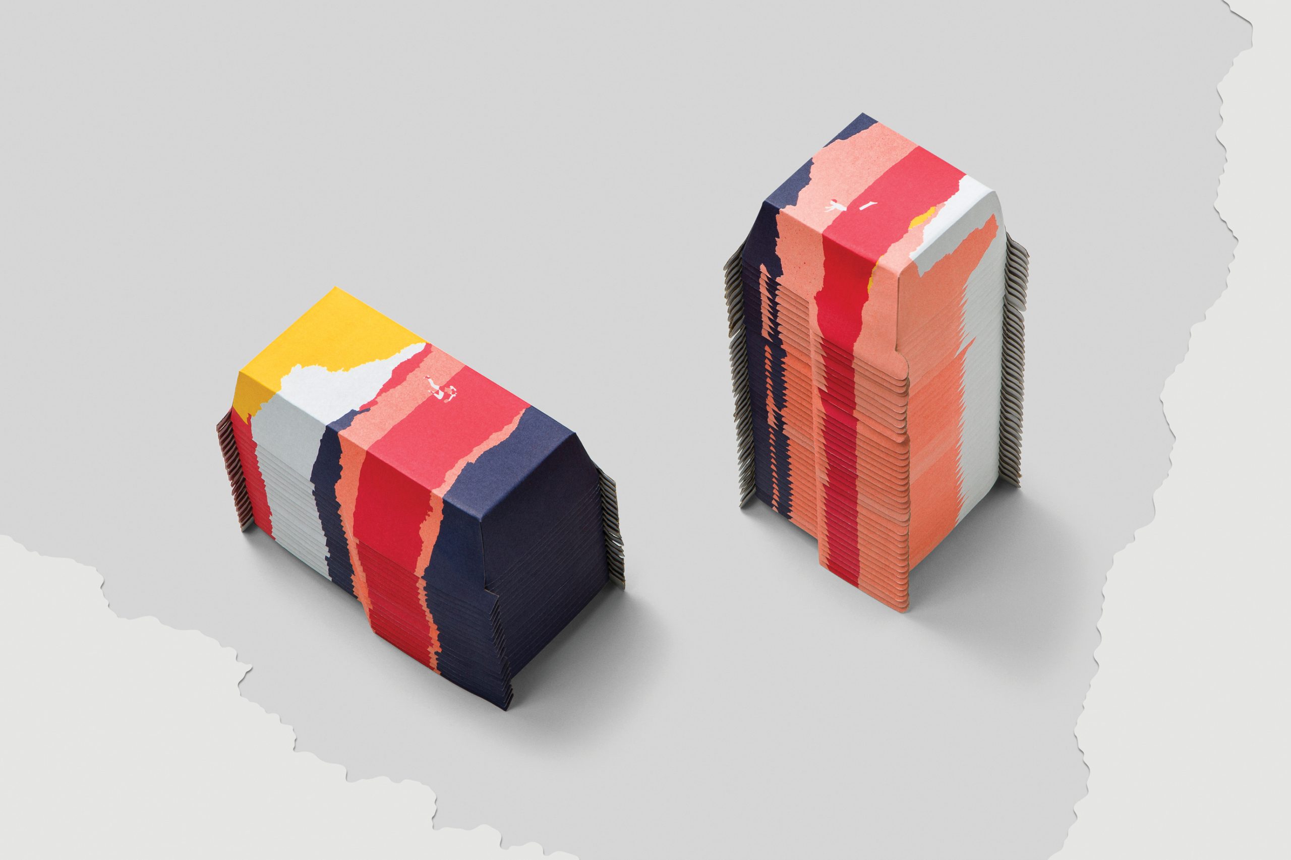
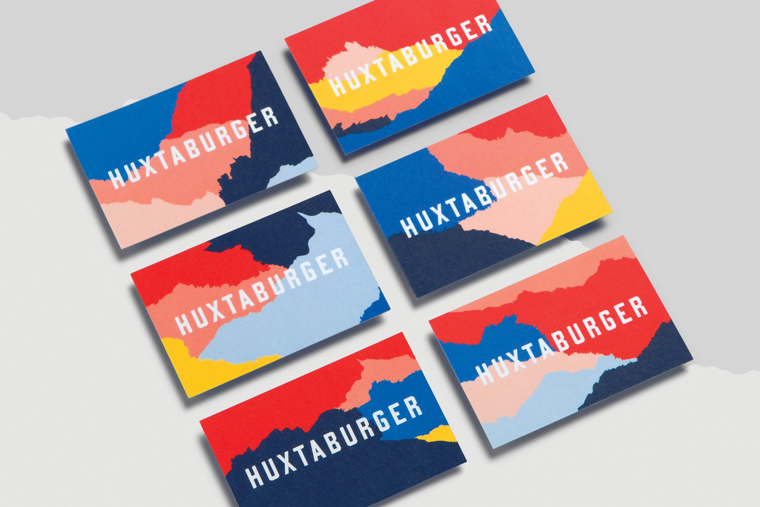
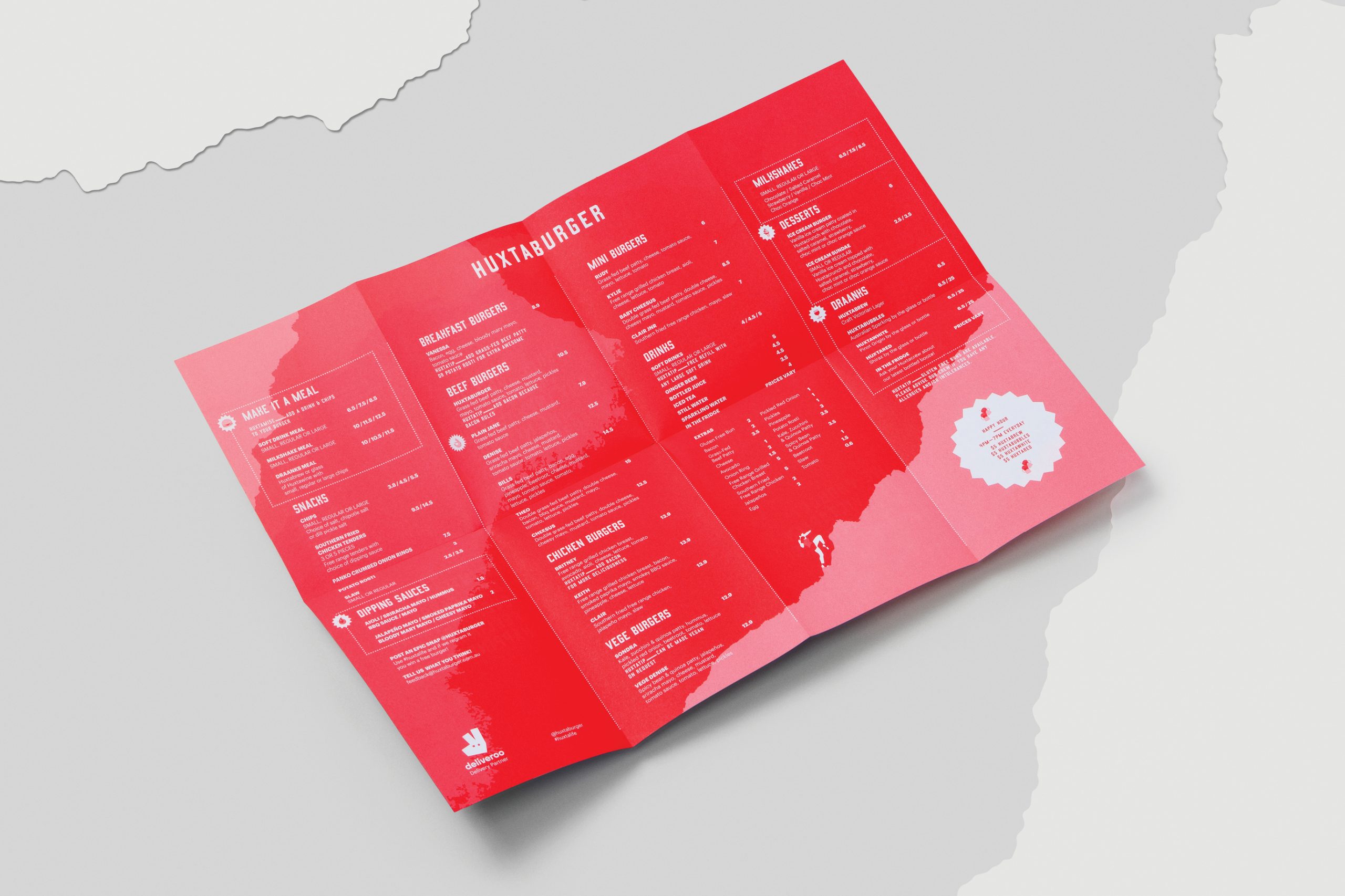
The Outcome: Graphic landscapes take inspiration from destinations in which Huxtaburger operate and also the visual look of the ingredients they use. The characters that you’ll discover throughout the visual identity embody Huxtaburger’s brand positioning by portraying people doing extreme things. The typography/logotype design was a refresh of the existing logo, uniting past and present with added confidence and strength.
Credits:
Photography (Collateral) by Foliolio
Printing (Packaging) by O'Kelly Group
Printing (Collateral) by Gunn & Taylor
Photography (Collateral) by Foliolio
Printing (Packaging) by O'Kelly Group
Printing (Collateral) by Gunn & Taylor
