Project:
Co.Co
Key Message:
A colourful collection of people,
personalities and products.
Your lifestyle confetti.
Co.Co
Key Message:
A colourful collection of people,
personalities and products.
Your lifestyle confetti.
Sector:
Homewares
Scope of Works:
Branded Environments
Brand Identity
Digital Design
Creative Strategy
Graphic Design
Livery Design
Naming
Packaging
Print Design
Homewares
Scope of Works:
Branded Environments
Brand Identity
Digital Design
Creative Strategy
Graphic Design
Livery Design
Naming
Packaging
Print Design
Snapshot:
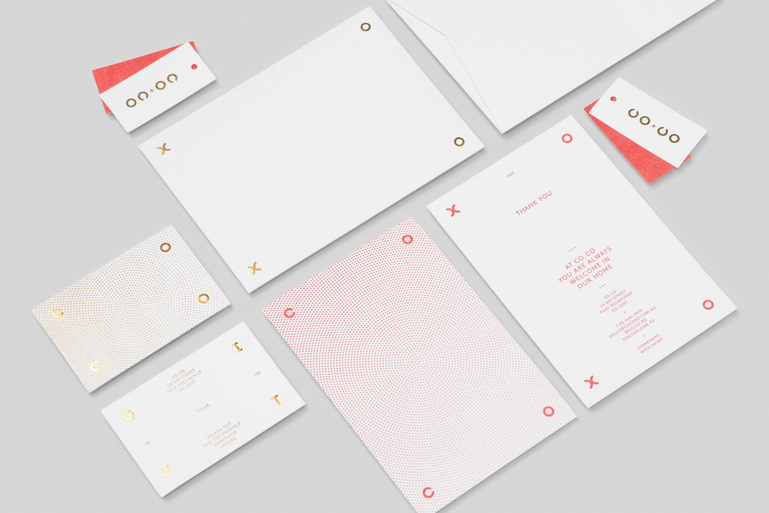
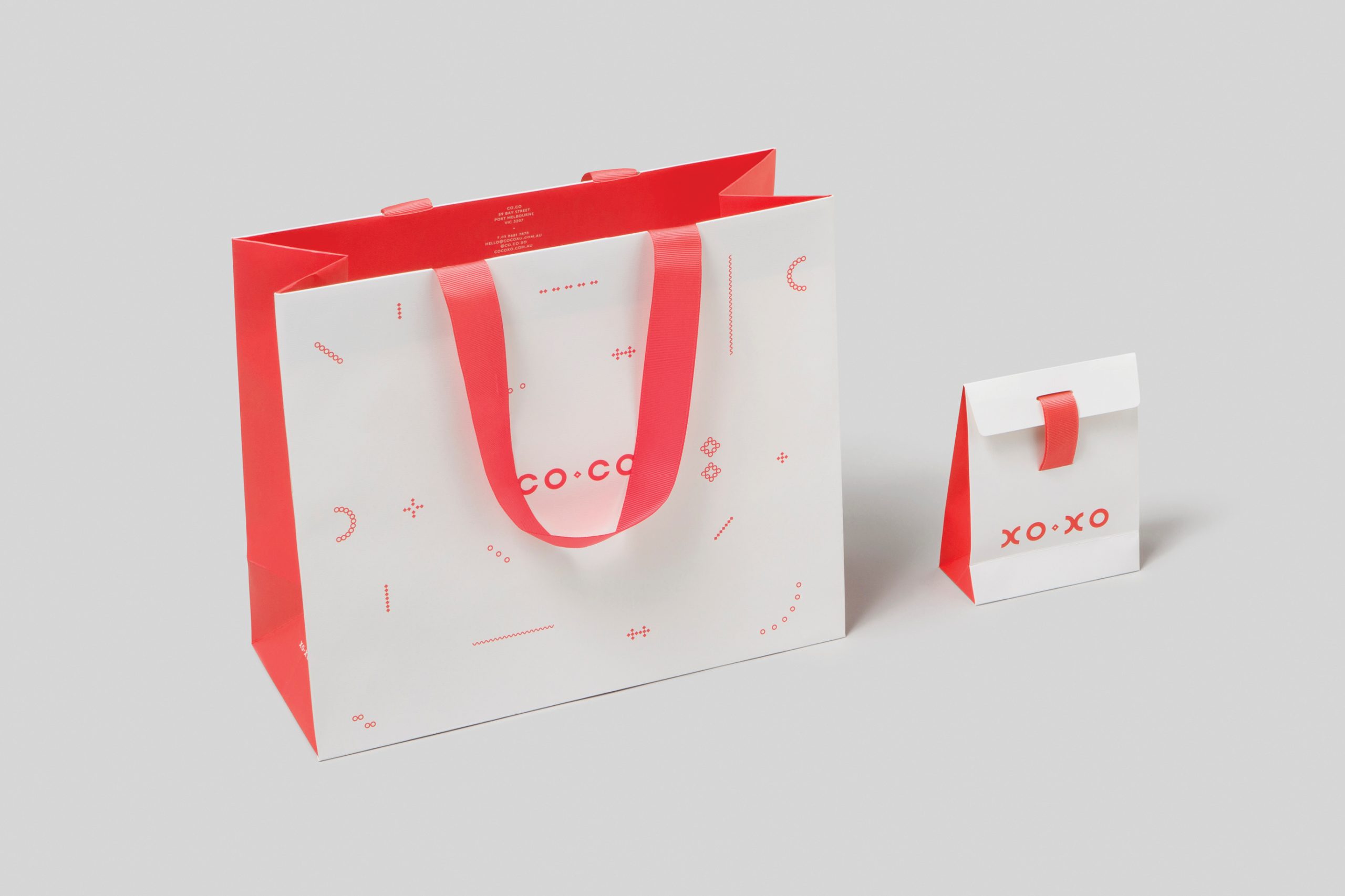
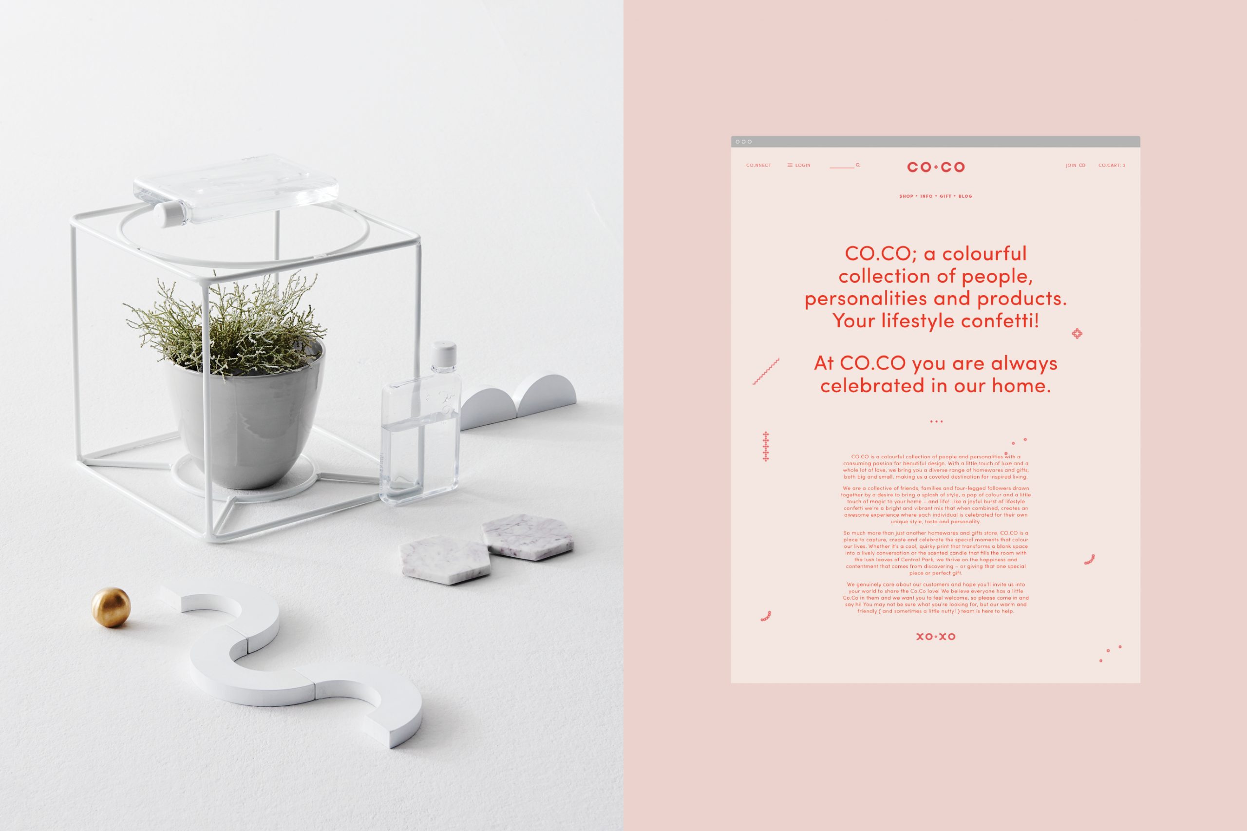
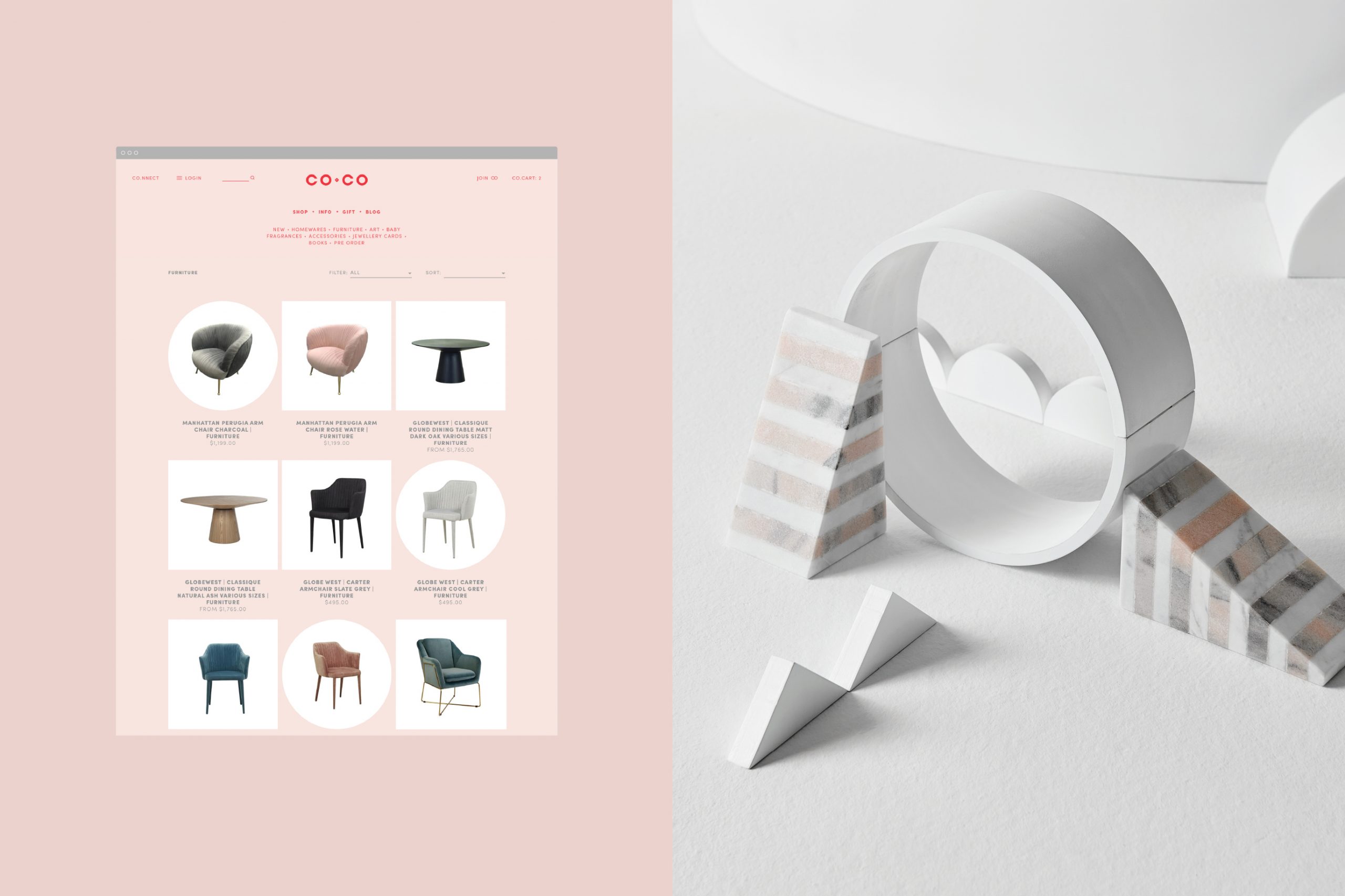
Co.Co is a colourful collection of people and personalities with a consuming passion for beautiful design. With a little touch of luxe and a whole lot of love, Co.Co brings you a diverse range of stylish and covetable homewares, furniture and gifts, making us a must-visit destination for inspired designer living.
The Objective: A refreshed brand identity to elevate visual values to align with the quality of Co.Co's product offering.
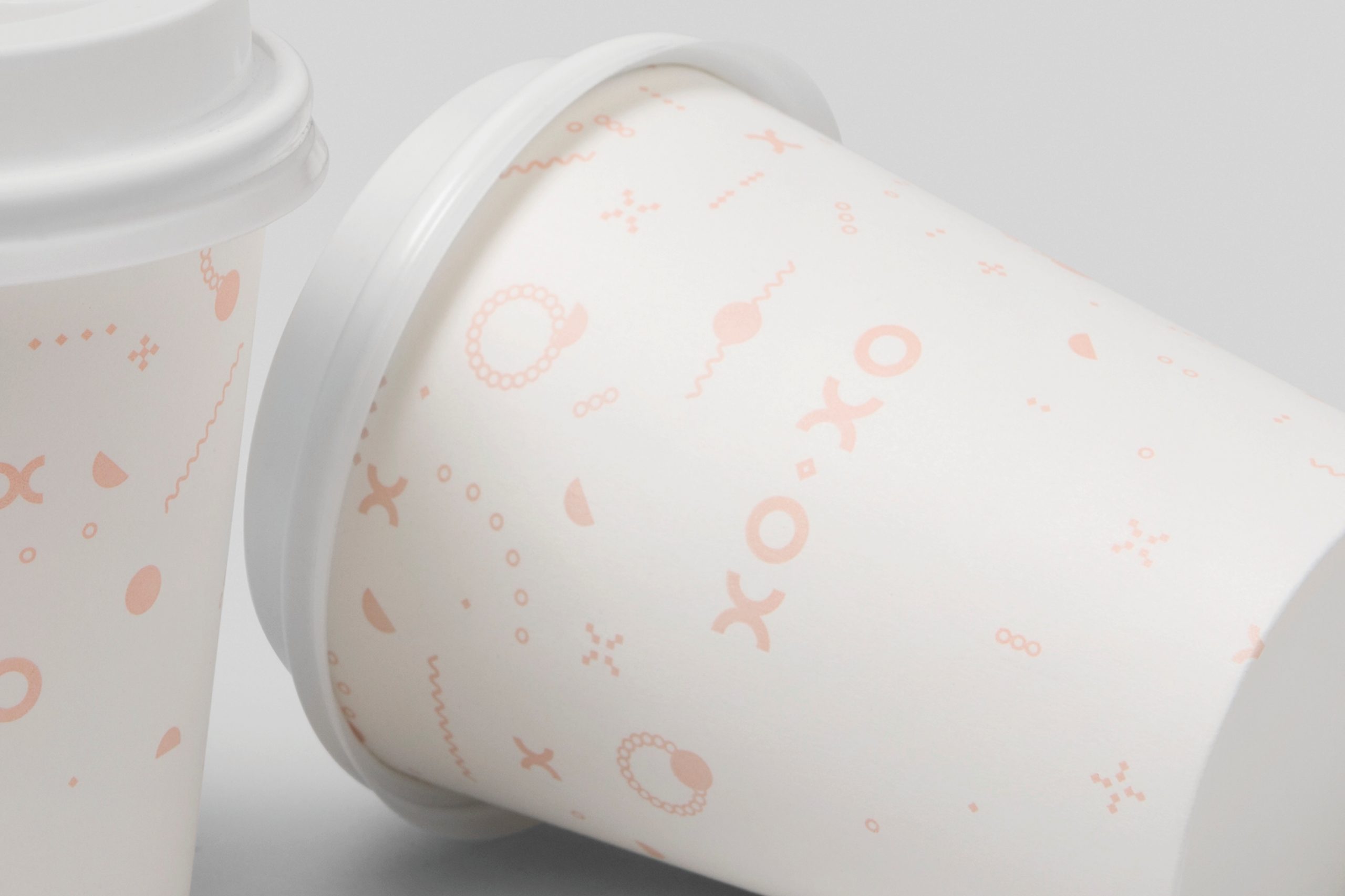
The Opportunity: To create an elevated new visual and verbal identity that captures the colourful and unique characters who personify Co.Co’s community and celebrates the everyday, embracing the opportunity we have as customers to elevate our living spaces - and our lives - through carefully curated purchases.
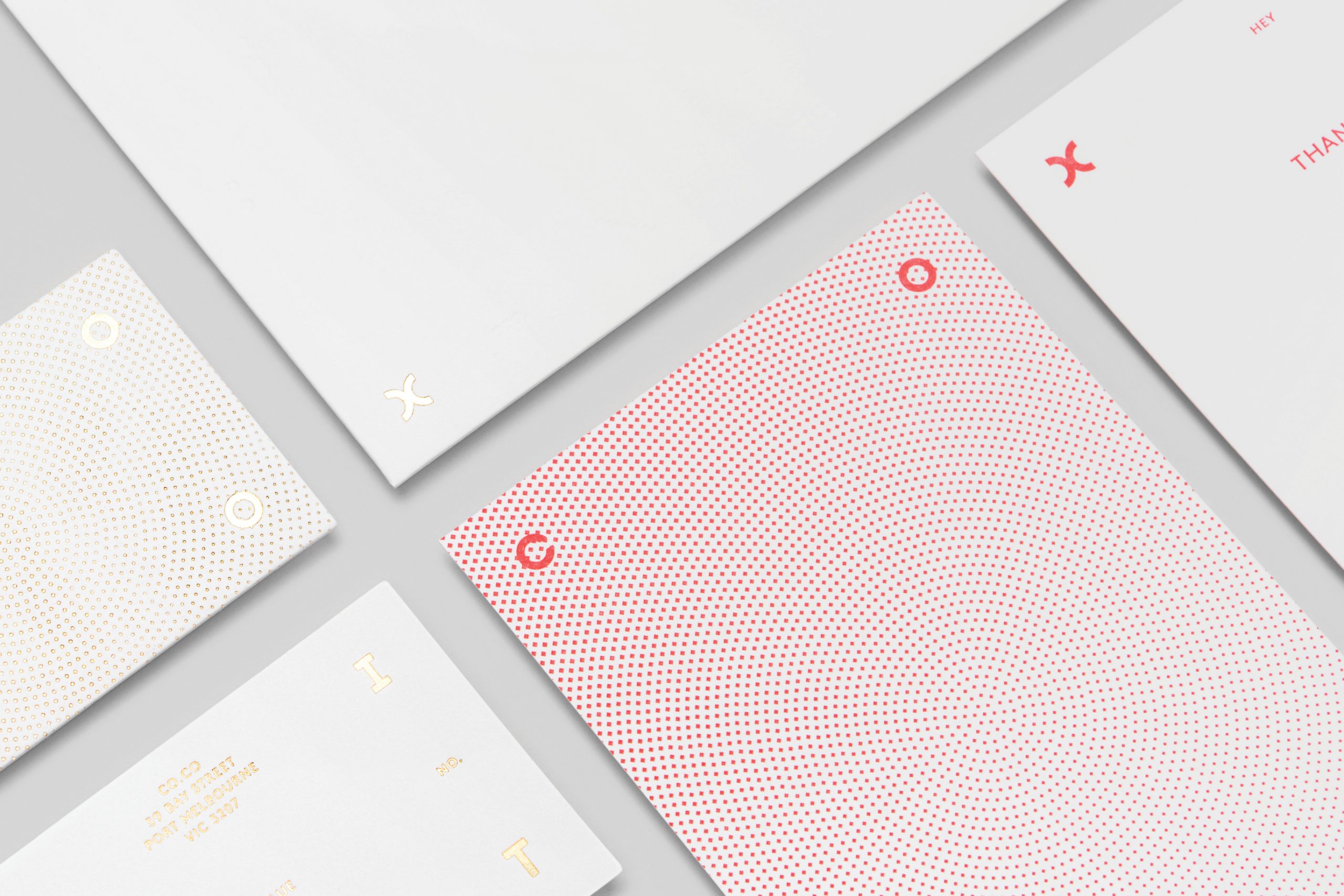
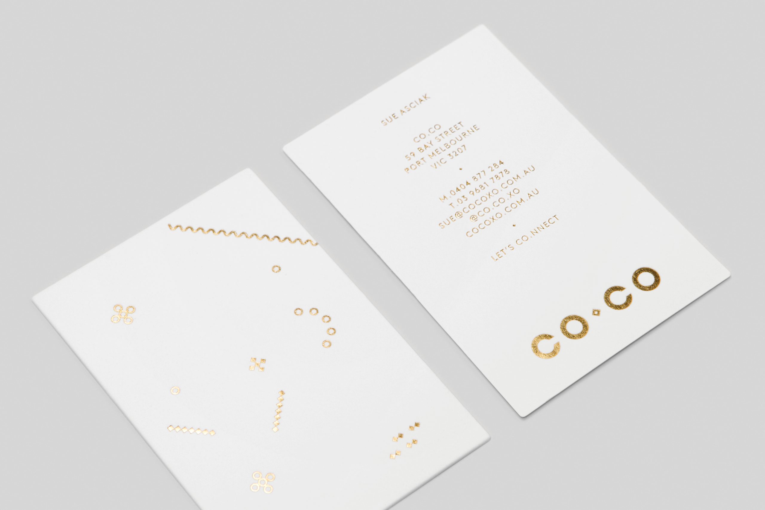
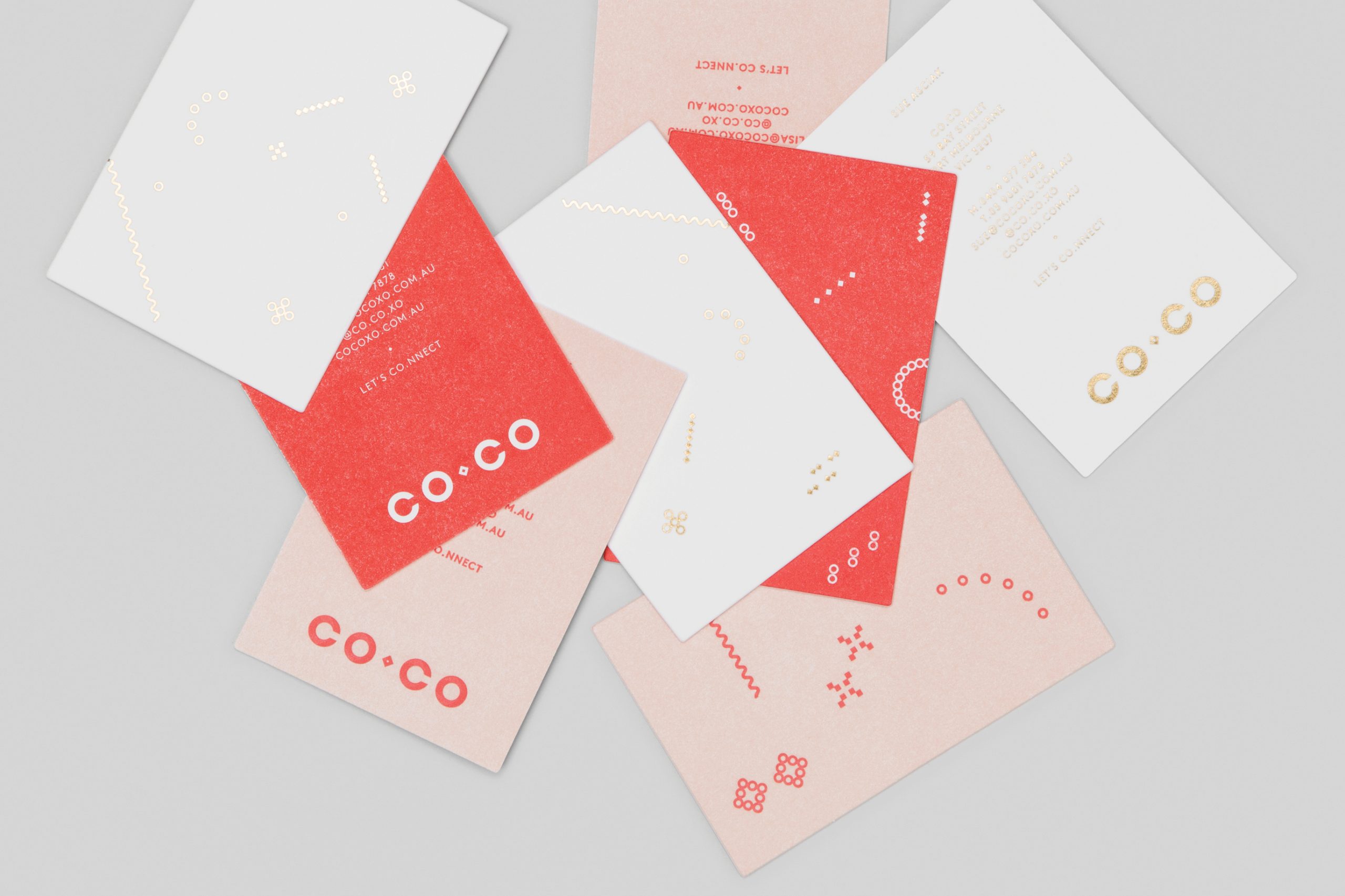
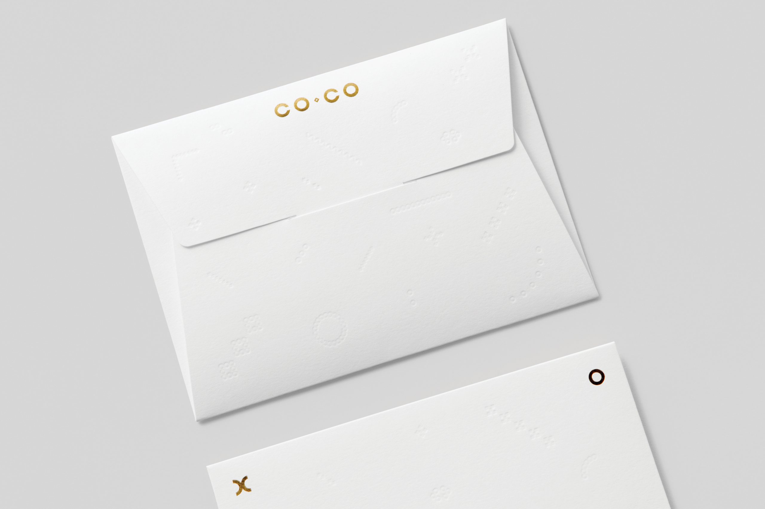
The Outcome: The graphic execution embodies core shapes found in many daily essentials and provides greater flexibility in all of Co.Co’s creative touchpoints. The identity also maintains a distinctly feminine edge in response to the brand’s heavily female-skewed market demographic.
Credits:
Copywriting by Pop & Pac + OneWord Studio
Photography (Collateral) by Foliolio
Photography (Product / Campaign) by Lisa Cohen
Printing (Collateral) by Hungry Workshop
Printing (Packaging) by Packaging People
Signage Production by Premier Graphics
Copywriting by Pop & Pac + OneWord Studio
Photography (Collateral) by Foliolio
Photography (Product / Campaign) by Lisa Cohen
Printing (Collateral) by Hungry Workshop
Printing (Packaging) by Packaging People
Signage Production by Premier Graphics

